Client:
Self Promotion
Year:
2023
Und - Stationery v3.2
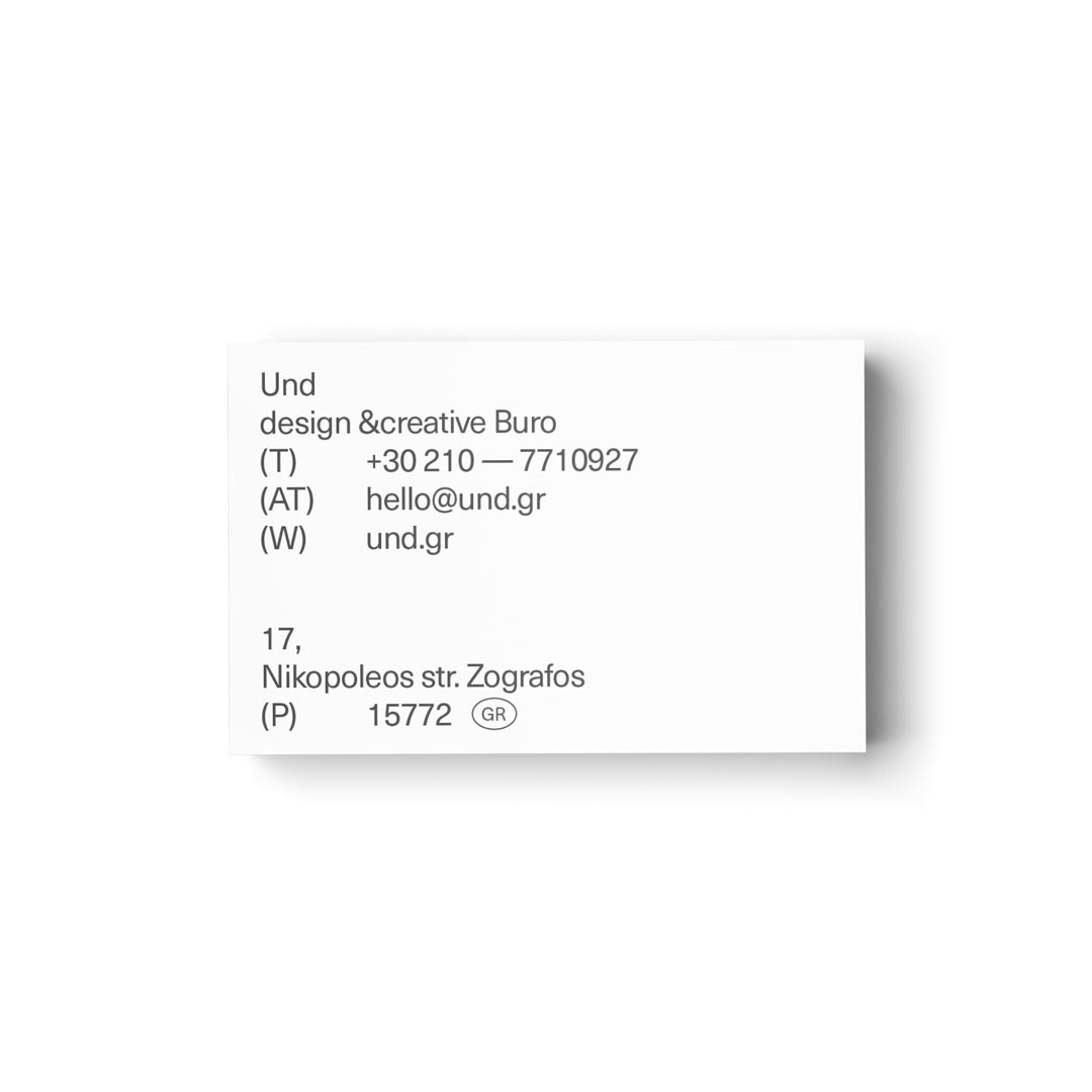
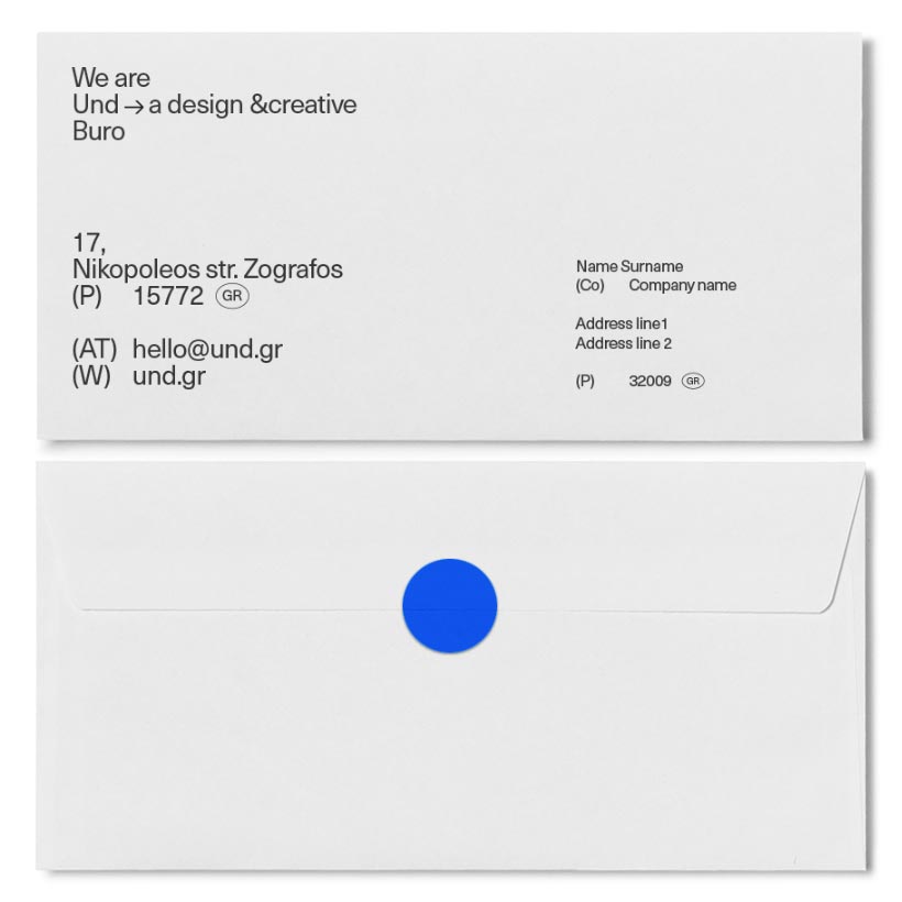
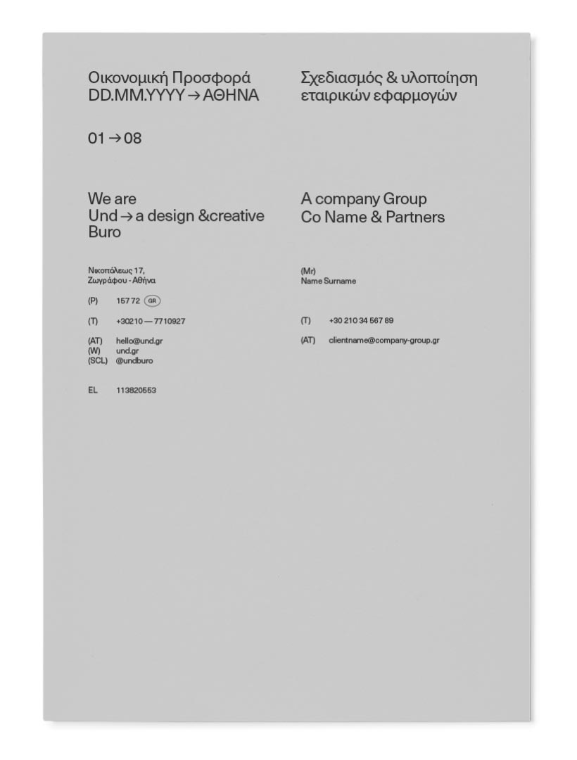
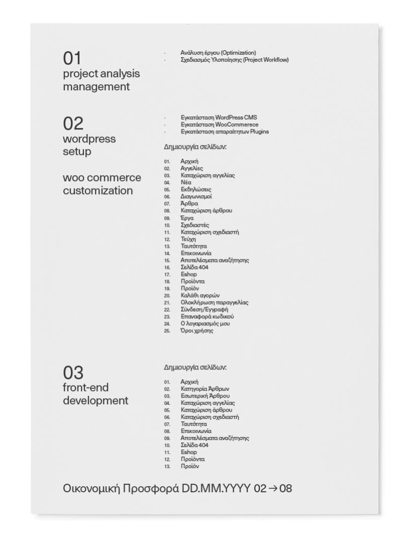
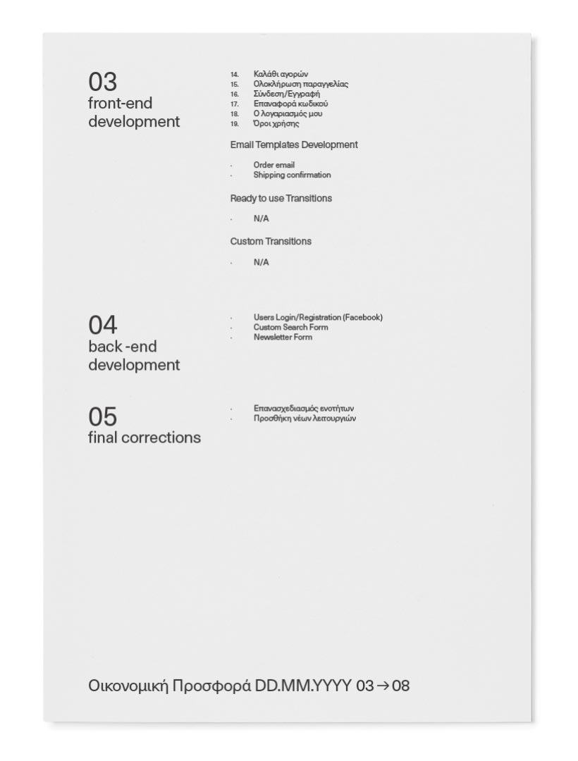
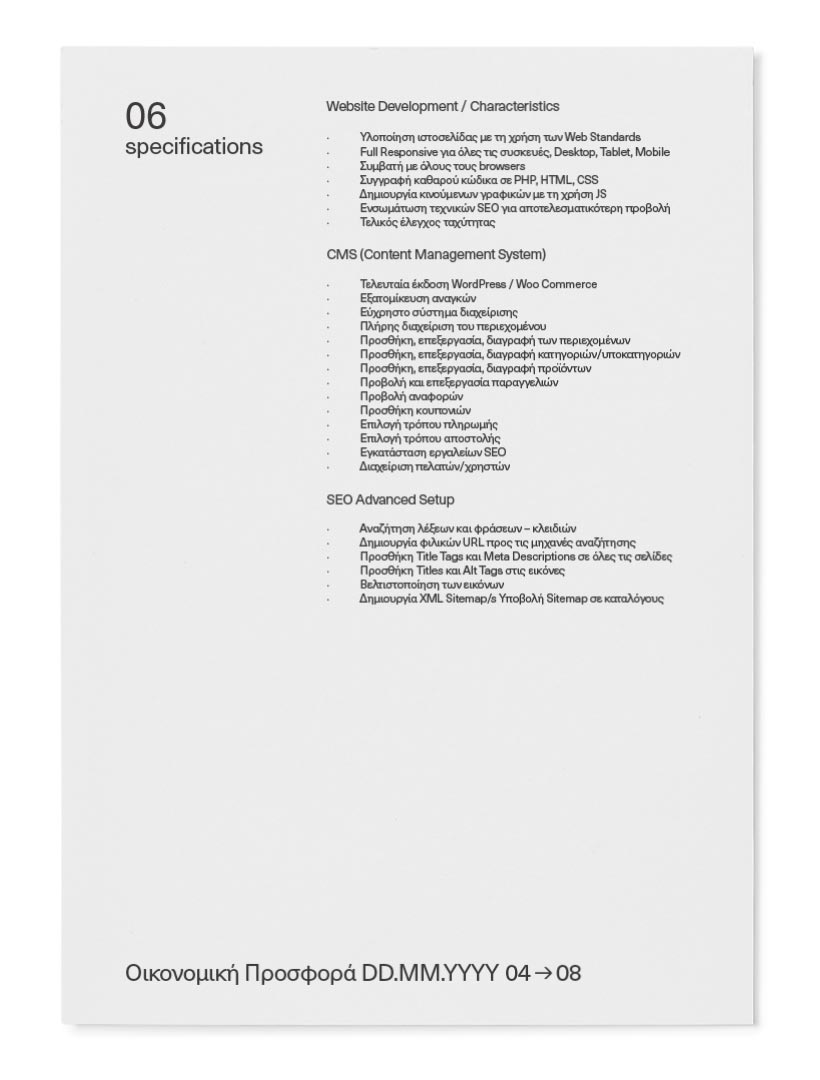
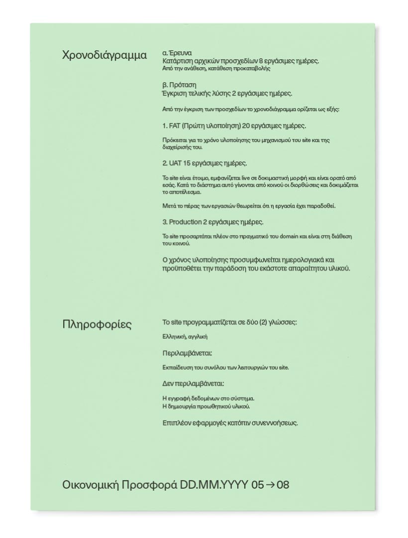
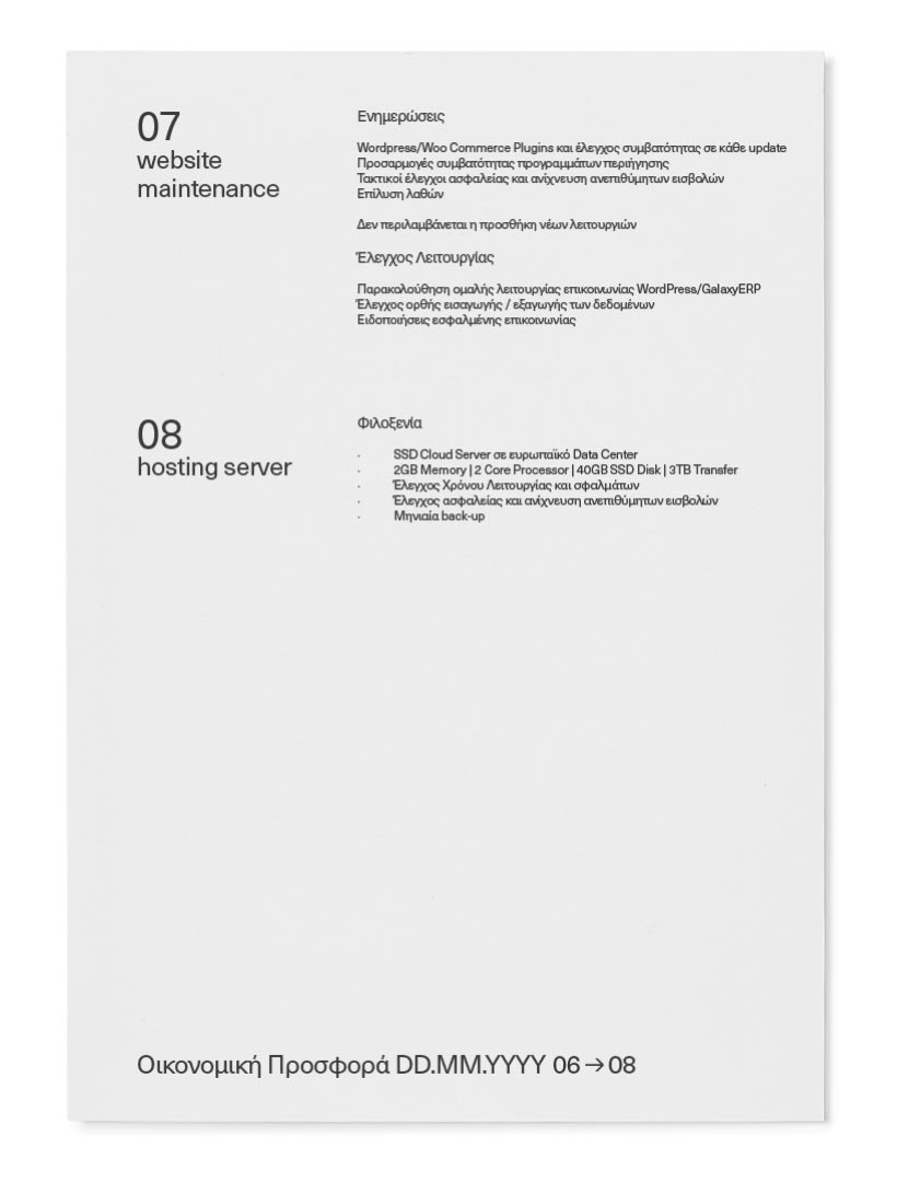
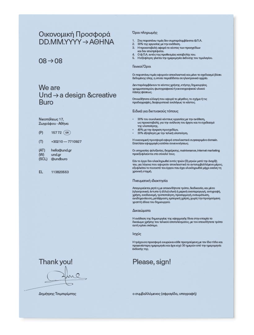
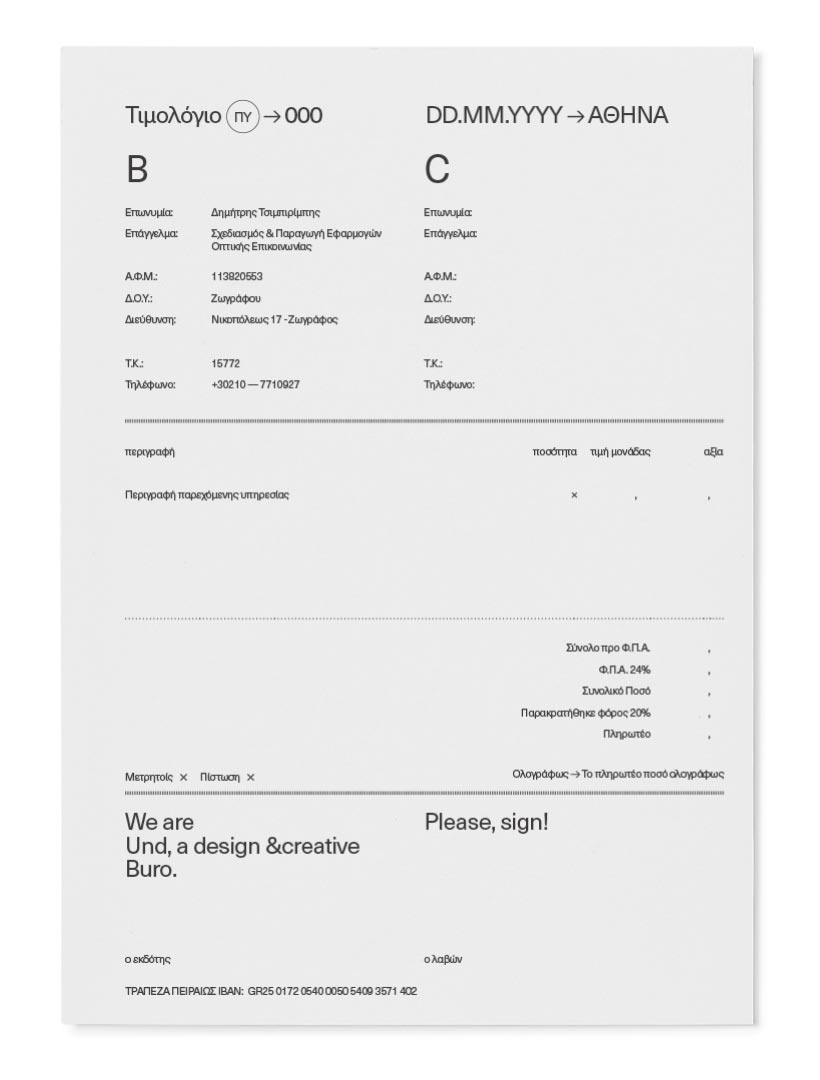
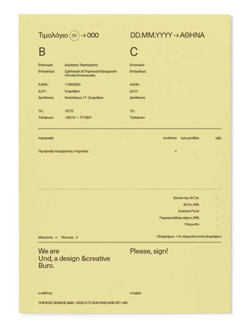
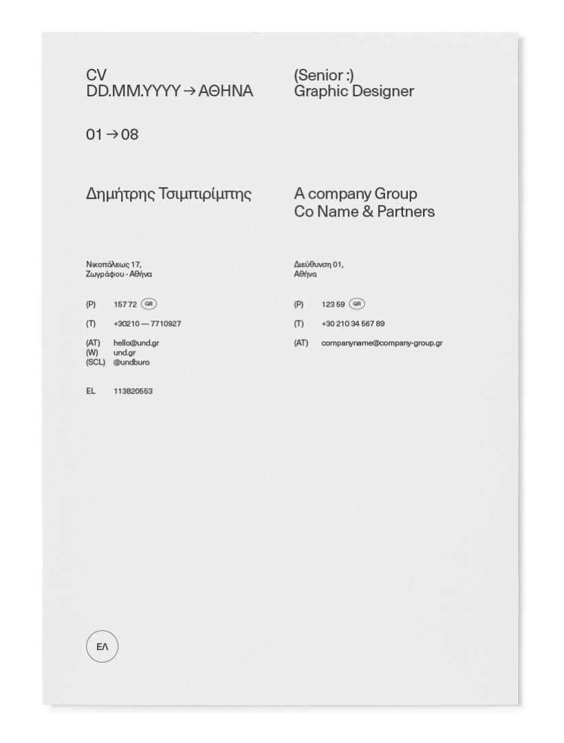
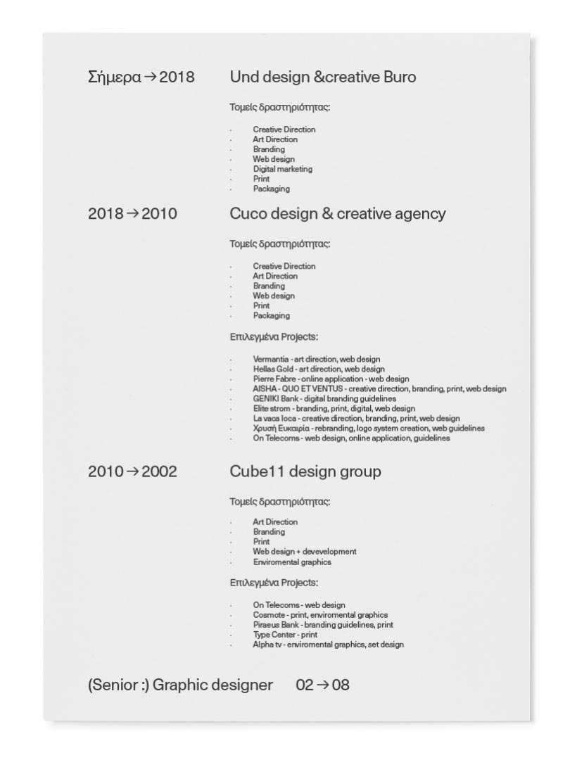
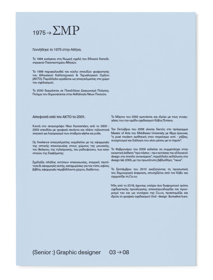
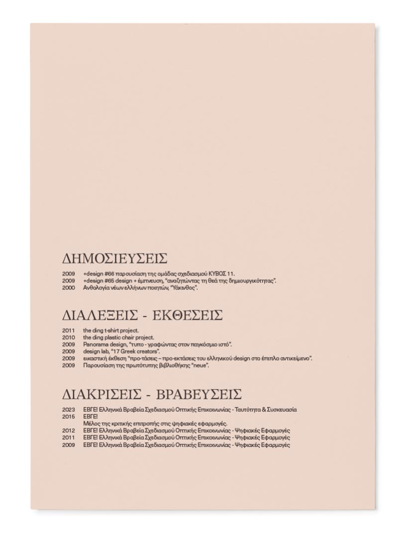
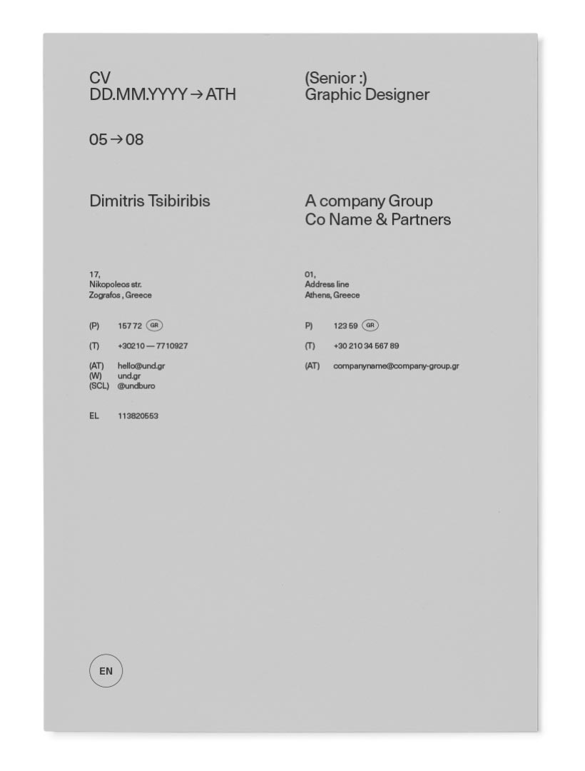
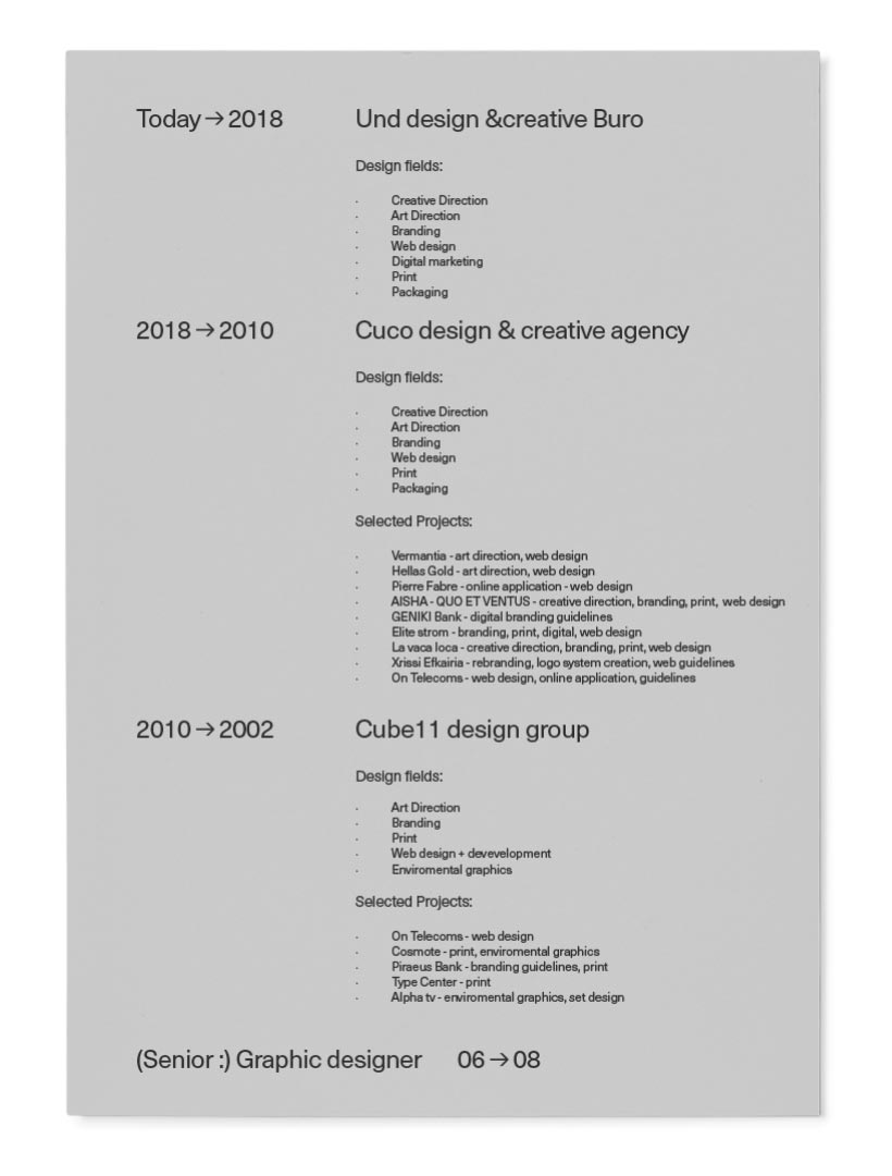
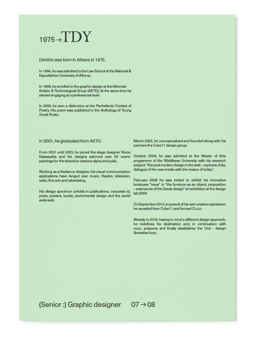
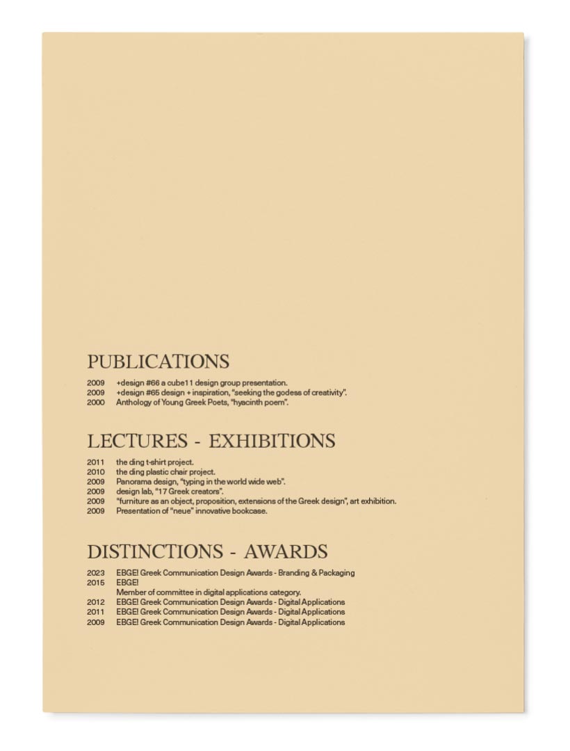
Our company forms were designed with functionality, homogeneity in mind, but above all, easy management and archiving. They support the day-to-day management of a variety of tasks, in their full scope.
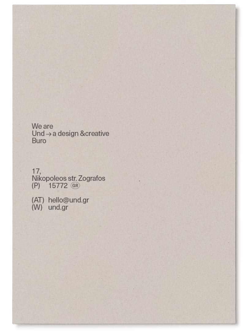
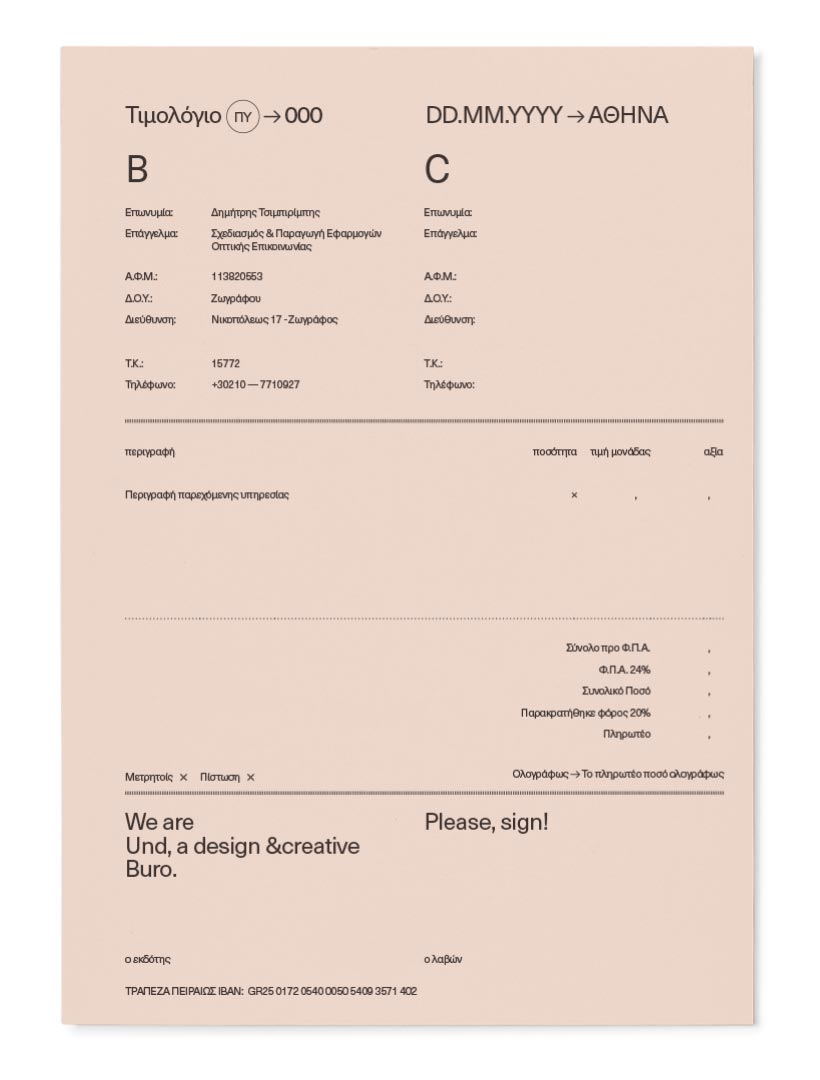
The concept is particularly simple: in addition to the typographical style and individual specific markings, a common photocopy paper, in selected color shades, is used.
The use of color can never be strictly defined, but is integrated into the corporate image, as it emerges, through the material available at any given time, ensuring distinctiveness and ease of reading. At the same time, it gives a variable, but uniform image, to a classified randomness.
The third version concerns the overall upgrade of an existing design.
●
Design:
Undburo
What we did:
Art direction, Branding, Creative direction, Identity, Information Architecture, Misc, Naming, Non Profit, Print,
EFF

INVC
CMV
ΕΛ
EN
STN

