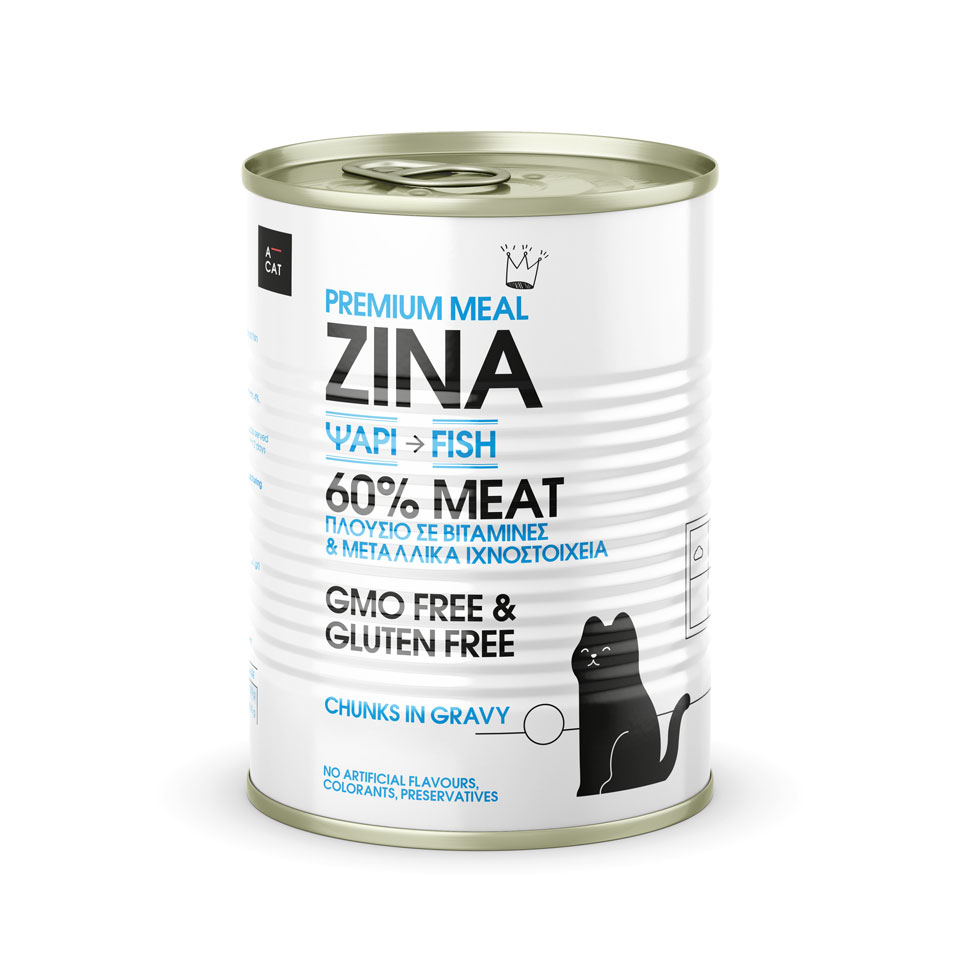
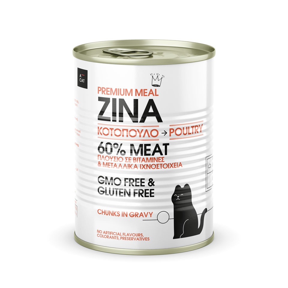
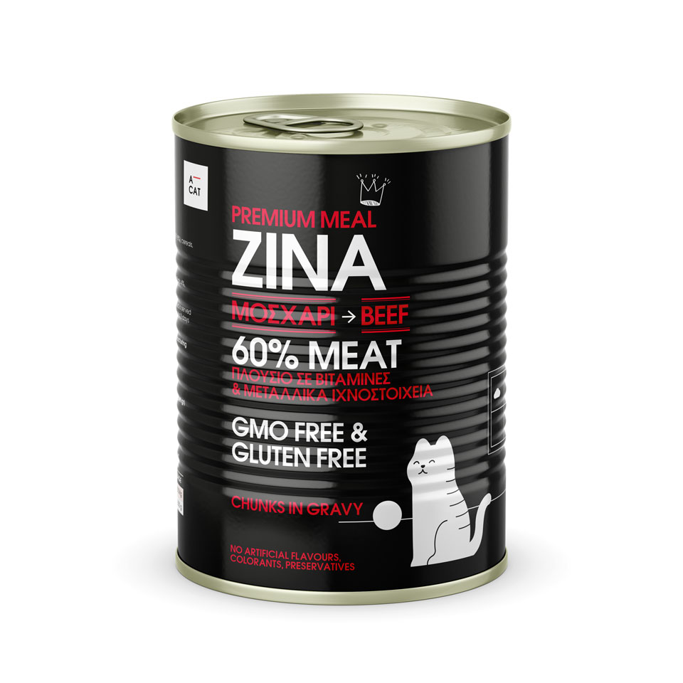
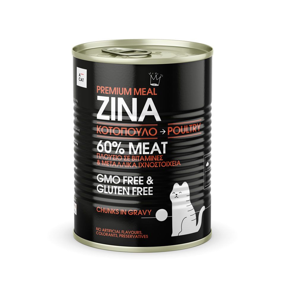
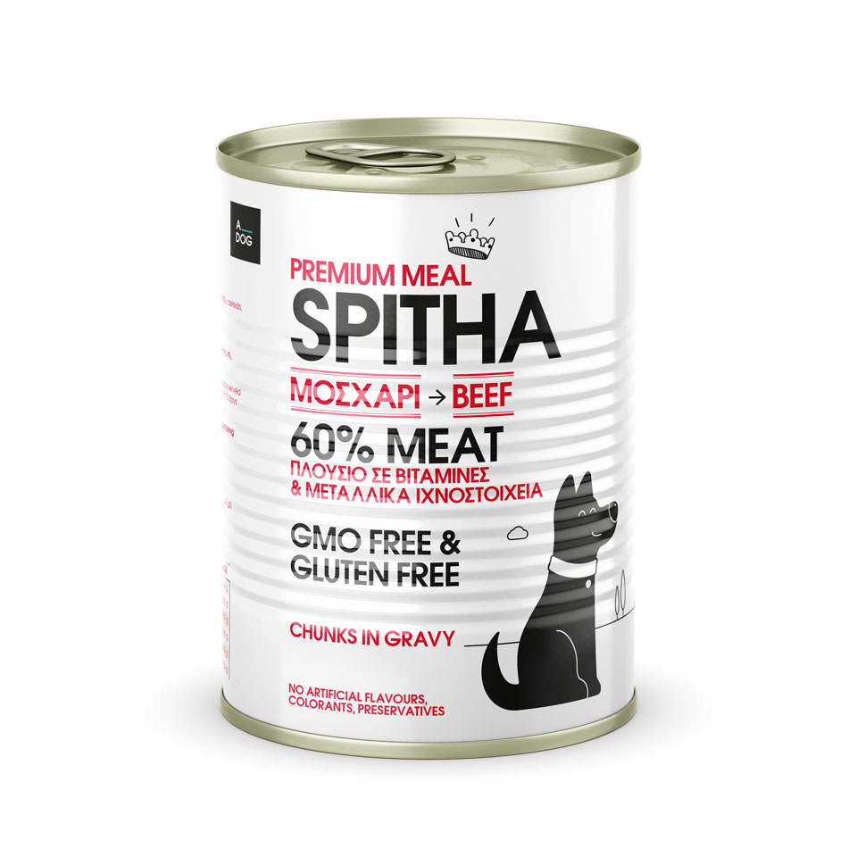
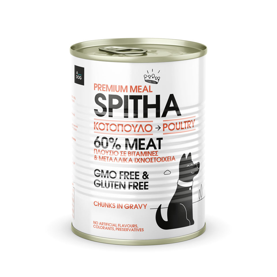
real pet, premium meal series
real pet ™ is a pet wholesale company.
From the beginning of its establishment, the company strategically produces and distributes its own selected products, enriching on the one hand its product range, on the other hand giving added quality value to the whole of its commercial activity.
The market investigation found a lack of a structured approach to the majority of pet food products, especially direct wholesale competition.
This finding led to specific decisions, aiming at a well-designed design proposal against the existing competition:
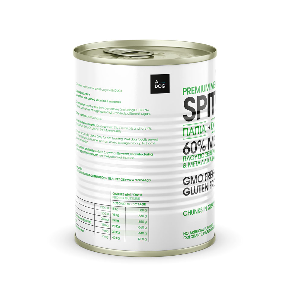
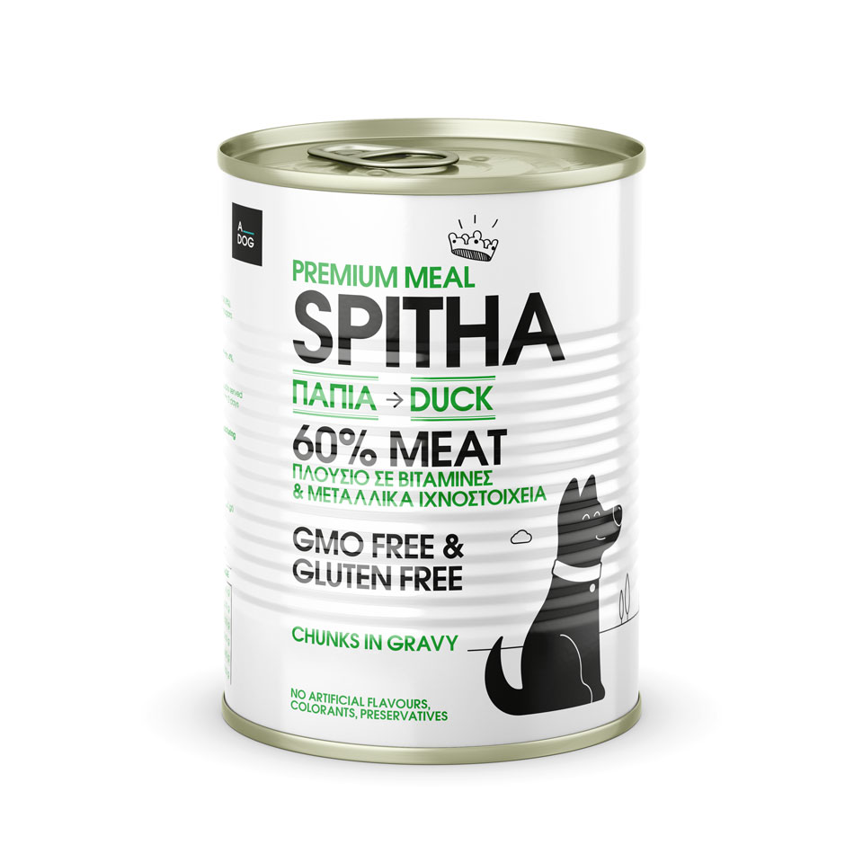
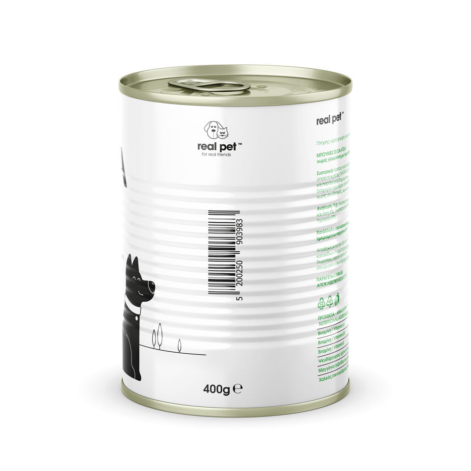
a. Organization of typography. Homogeneity and recognition among the quality product families of real pet, emphasis on typographic design, systematic arrangement of information.
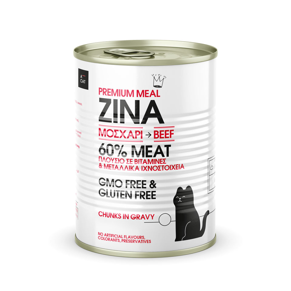
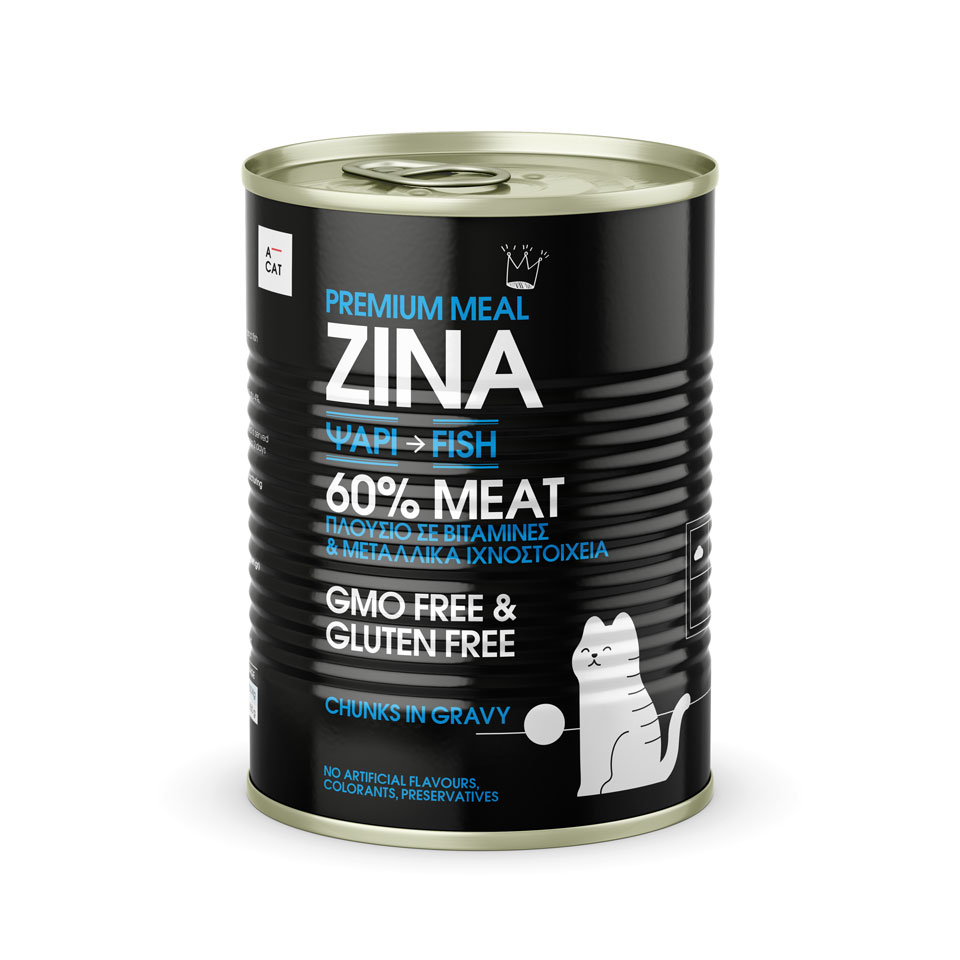
b. Pictorial markings (crown), dog – king and cat – queen.
c. Creating a specific, characteristic, color palette. Design prerequisite, the differentiation of the individual product titles, maintaining the same intensity. Differentiation from the competition.
d. Preservation of the white – black color in the titles, constant reference in the color variations. Homogeneity and recognizability among existing product families, flexibility, the use of silver or gold in selected locations, including titles, will cover the creation of two additional price category levels in the future.
e. Illustration – abstract, in a modern aesthetic with clean, bold lines, serves the typography, makes the product distinct, allows color changes.
●
What we did:
Art direction, Branding, Identity, Illustration, Information Architecture, Logotype, Packaging, Print,
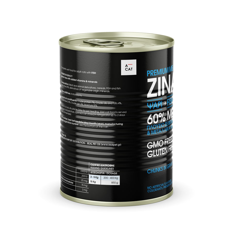
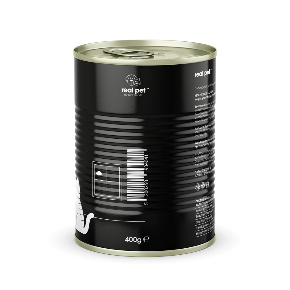
CAT
Cat's - Premium - meal flavors.
Sides.
DOG
Dog's - Premium meal - flavors.
Sides.
