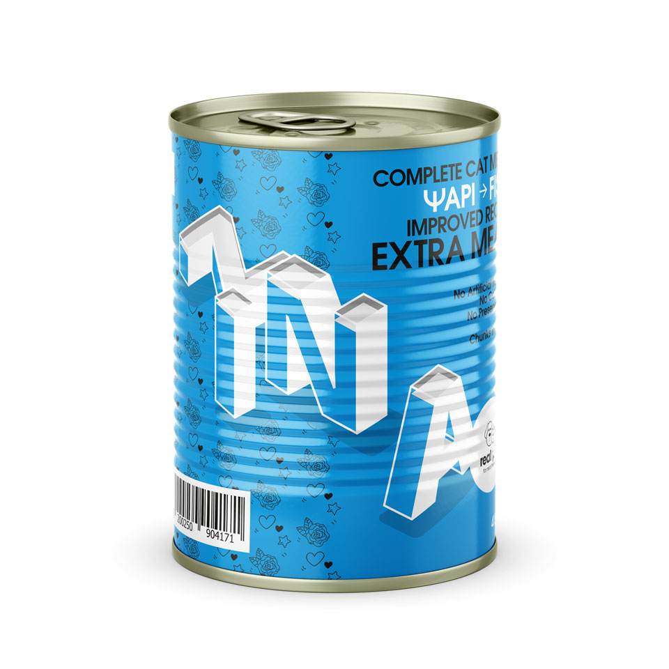
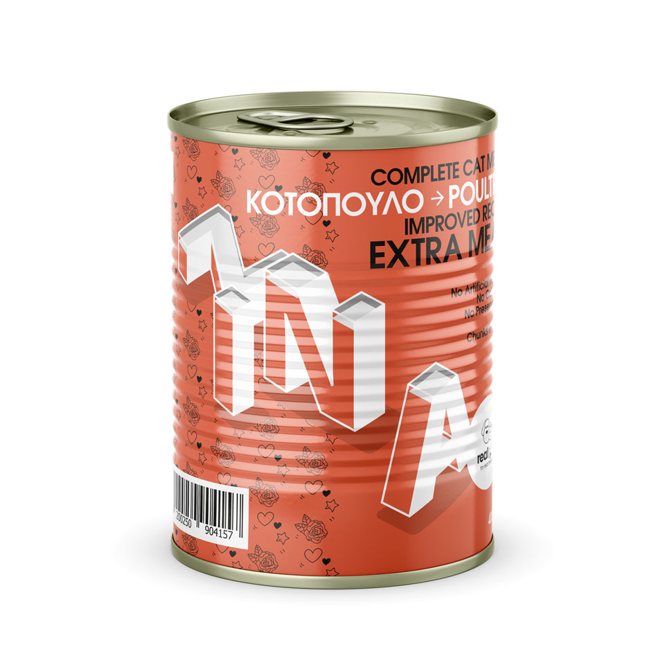
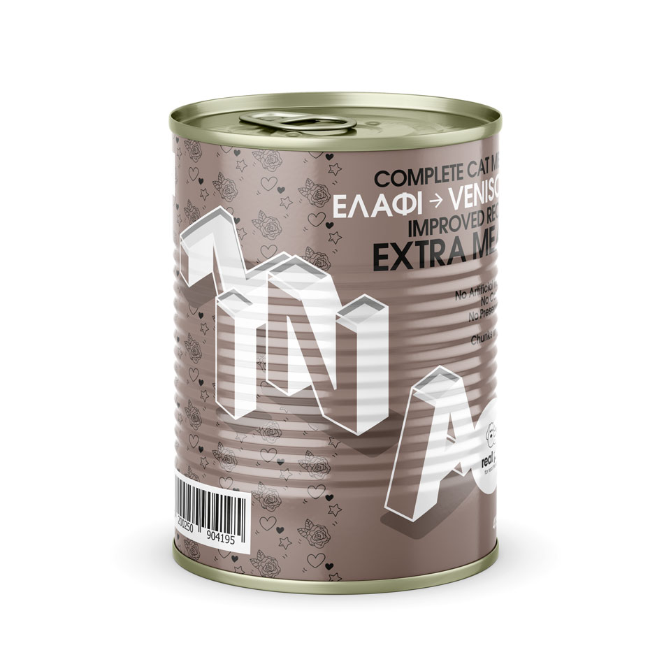
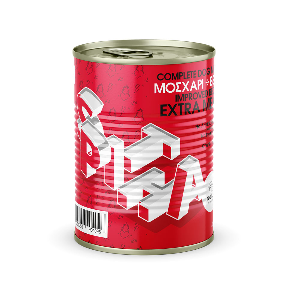
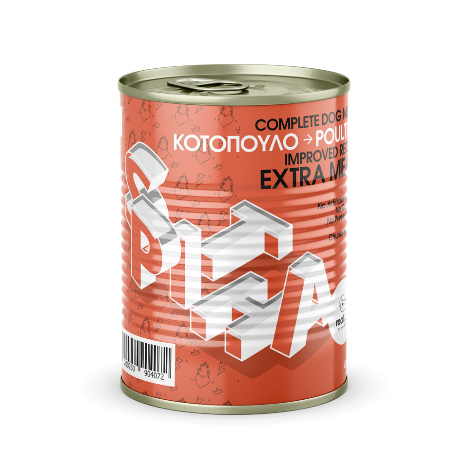
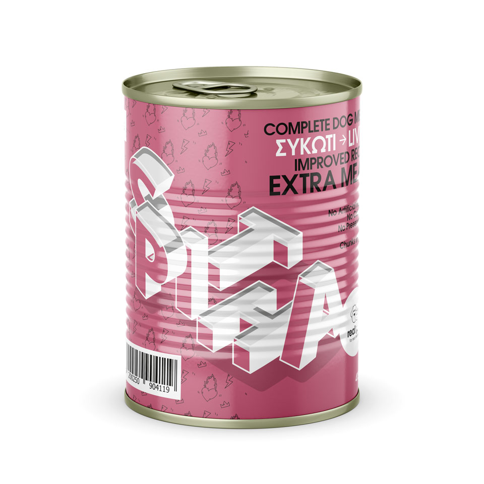
real pet, complete meal series
real pet ™ is a pet wholesale company.
From the beginning of its establishment, the company strategically produces and distributes its own selected products, enriching on the one hand its product range, on the other hand giving added quality value to the whole of its commercial activity.
The - complete - series is the most popular, economical proposal of the company's food products.
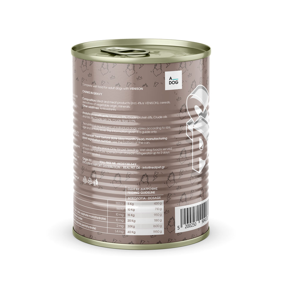
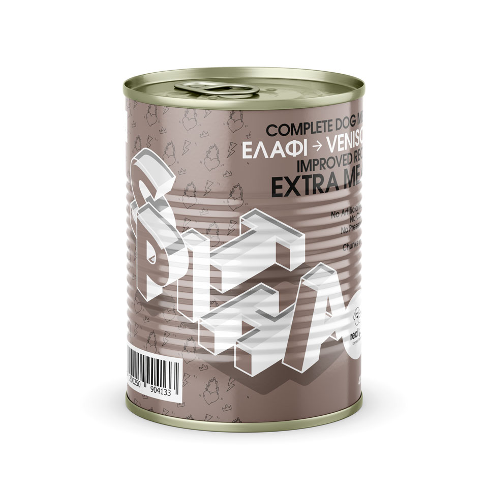
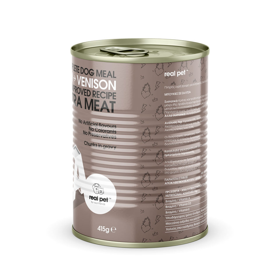
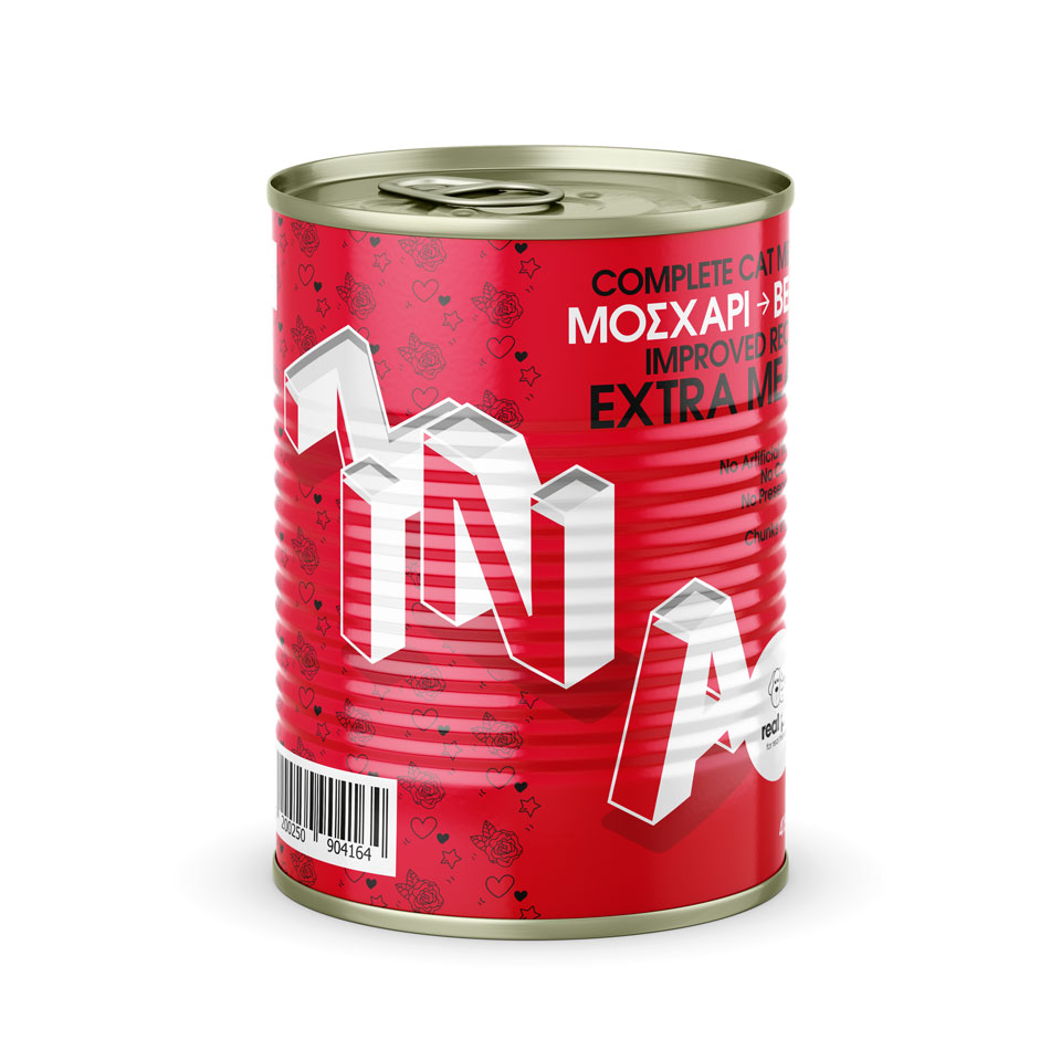
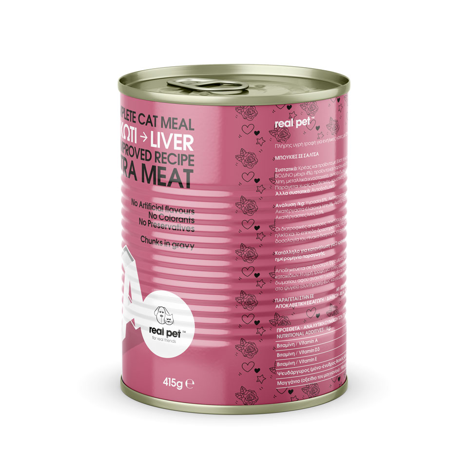
a. Organization of typography. Homogeneity and recognition among the quality product families of real pet, emphasis on typographic design, systematic arrangement of information.
b. Creating a specific, characteristic, color palette. The existing ones colors, indicative of the flavors, are transferred from "premium" series, while two additional distinct variations are harmonized. Design prerequisite, the differentiation of the individual product titles, maintaining the same intensity. Differentiation from the competition.
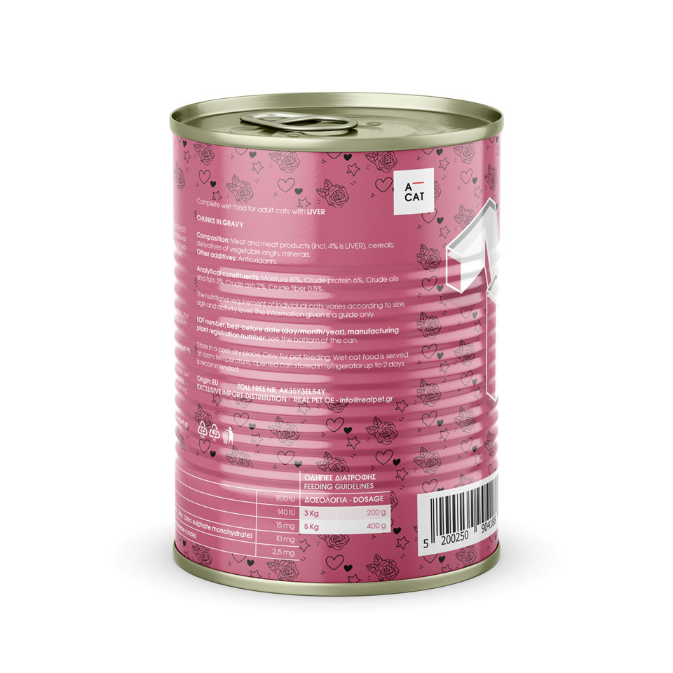
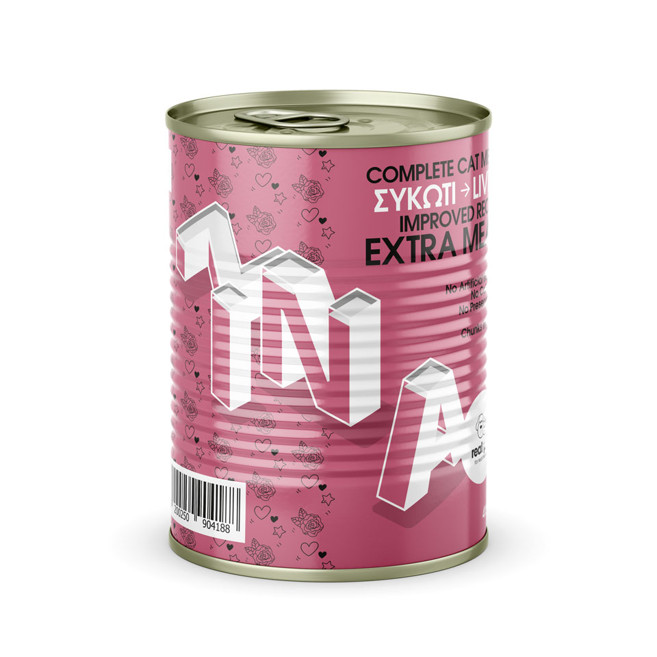
c. The illustration, a reference to the game, is limited to the three-dimensional typographic representation of the product titles. The characteristic color of the individual flavors prevails in the packaging, giving an extra pop character. Two different patterns have also been formed with direct reference to the names of the SPITHA - ZINA series.
●
Art Direction:
Undburo
What we did:
Art direction, Branding, Identity, Illustration, Information Architecture, Logotype, Packaging, Print,
CAT
Cat's - Complete - meal flavors.
Sides.
DOG
Dog's - Complete - meal flavors.
Sides.
