Client:
Iliaki elaiourgia
Year:
2019
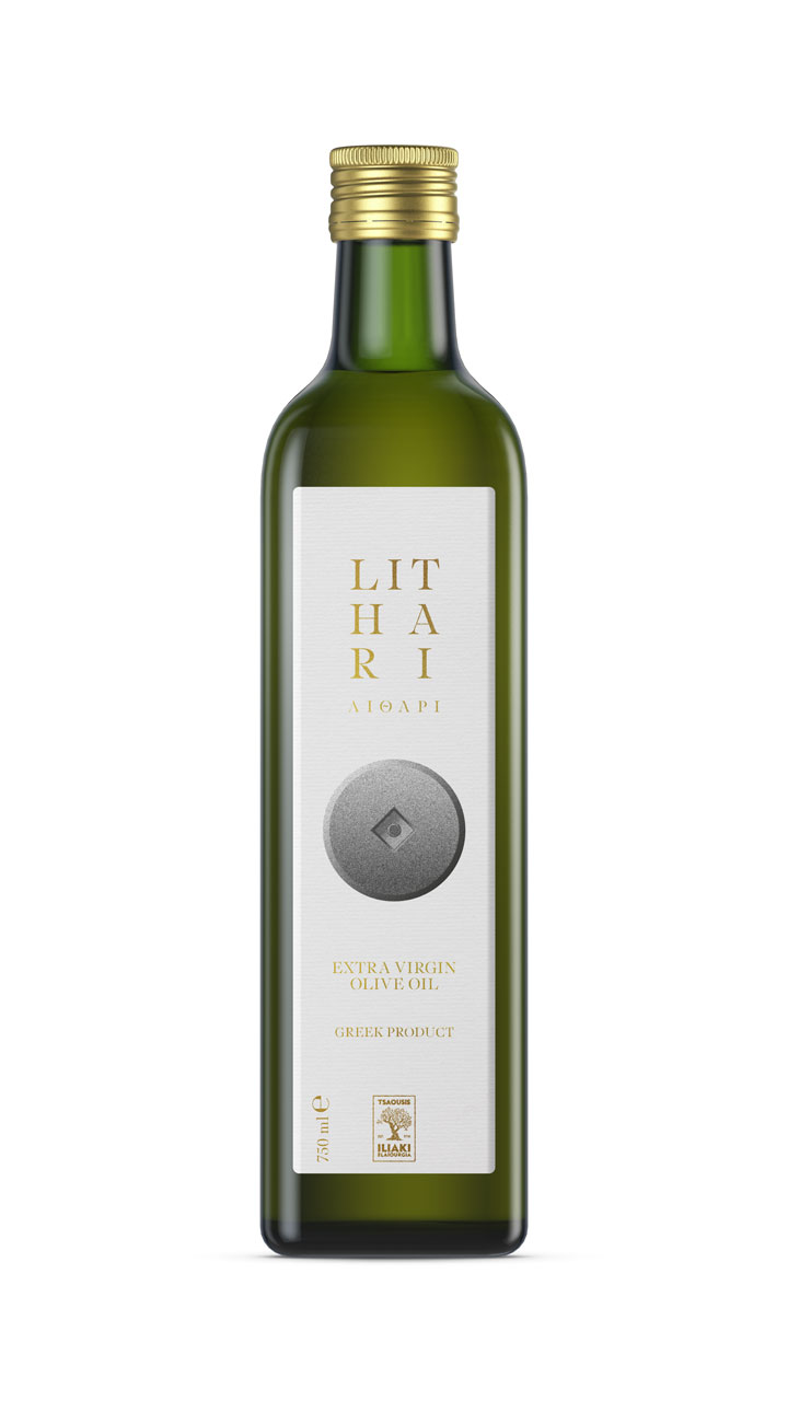
Iliaki elaiourgia - olive oil series
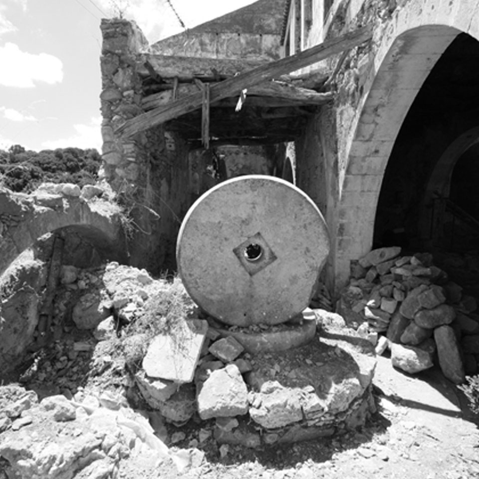
Iliaki Olive Oil is a company active in the field of olive oil based in Epitalio, a small town in the prefecture of Ilia. Its history began in 1910 when Efthimios Tsaoussis built the first olive mill in Makrisia Olympia, where the stone was turned by horses. Today the family tradition has passed into the hands of the third generation, with the same love for the marketing and standardization of fine olive oil, but following the standards set by the competent authorities and always aiming for quality and high nutritional value products.
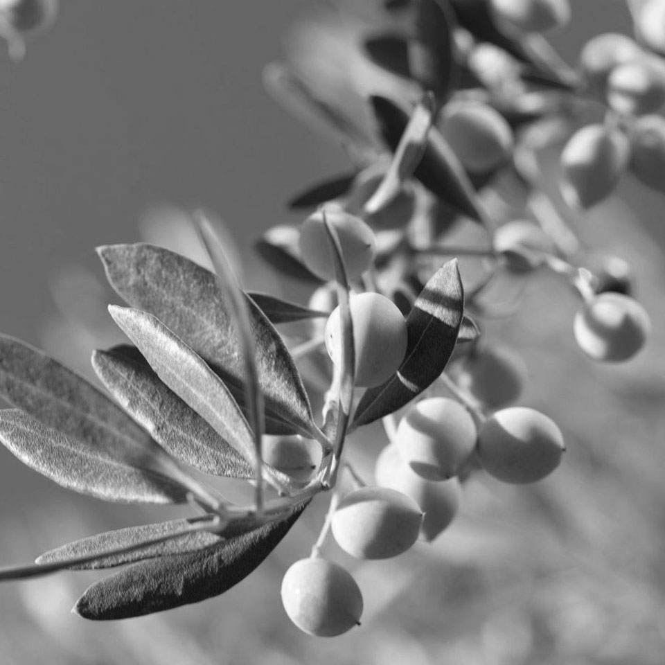
Olive groves are located in the wider area of Olympia as well as in the semi-mountainous western Peloponnese. Its olive oil stands out because of the climate of the area, because the olive groves are not irrigated and of course due to the distinctive Koronean variety, one of the oldest varieties in Greece.
The USA, Panama, Russia, Germany, Switzerland, Serbia, Hong Kong, Romania, the Netherlands are some of the countries where Extra Virgin Olive Oil is exported.
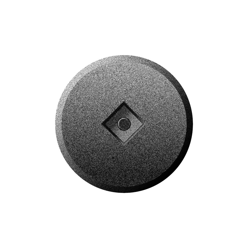
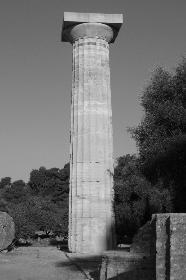
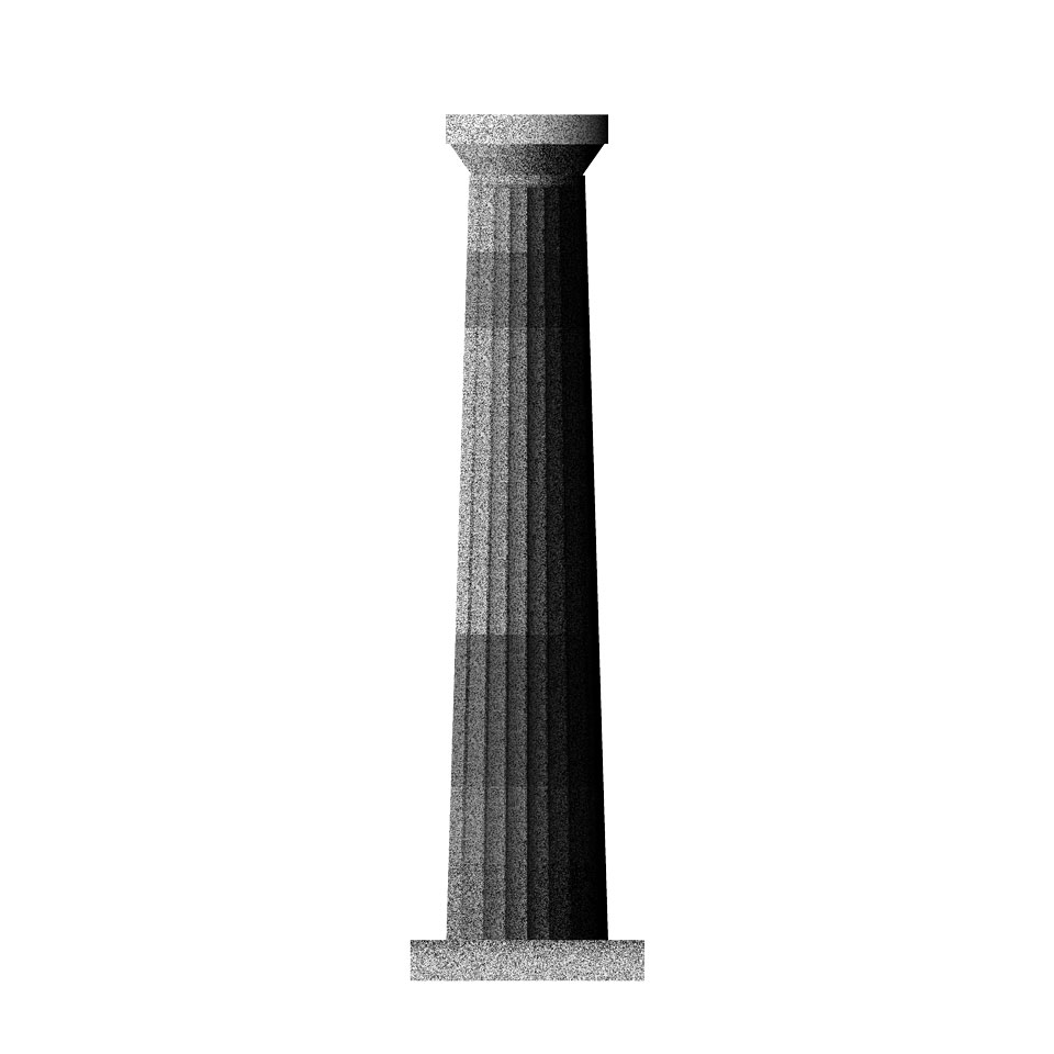
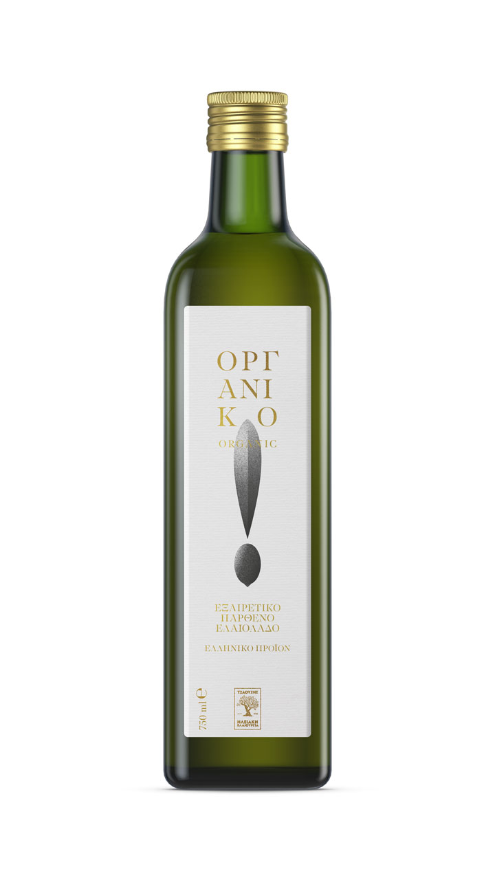
The illustration consists of clean and absolute forms. It was coated with a hard texture while the color range was strictly delimited in black and white. This indicates the solid & simple line of the Doric style, the hardness of the stone, the arid crops, the reference to the past, the absolute value.
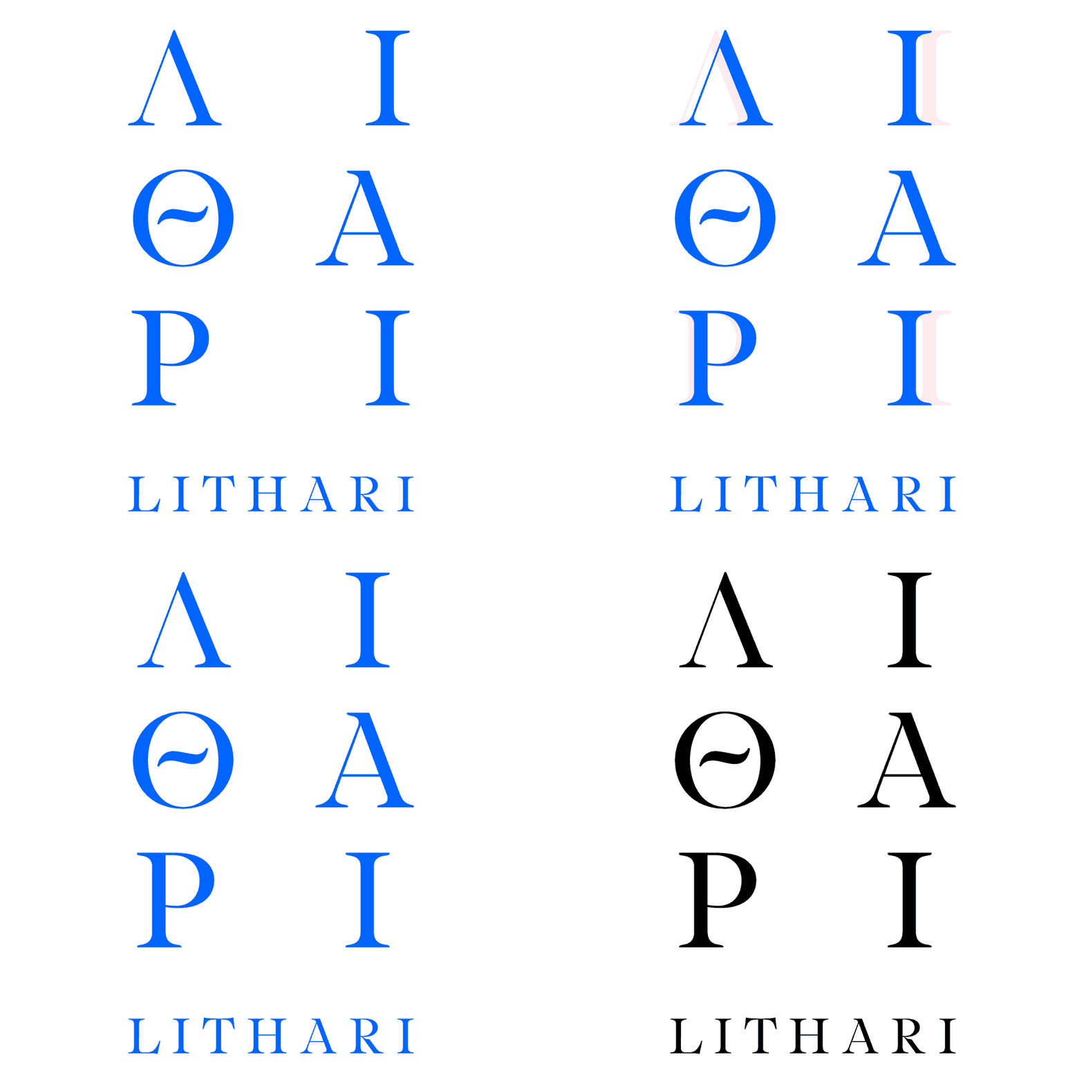
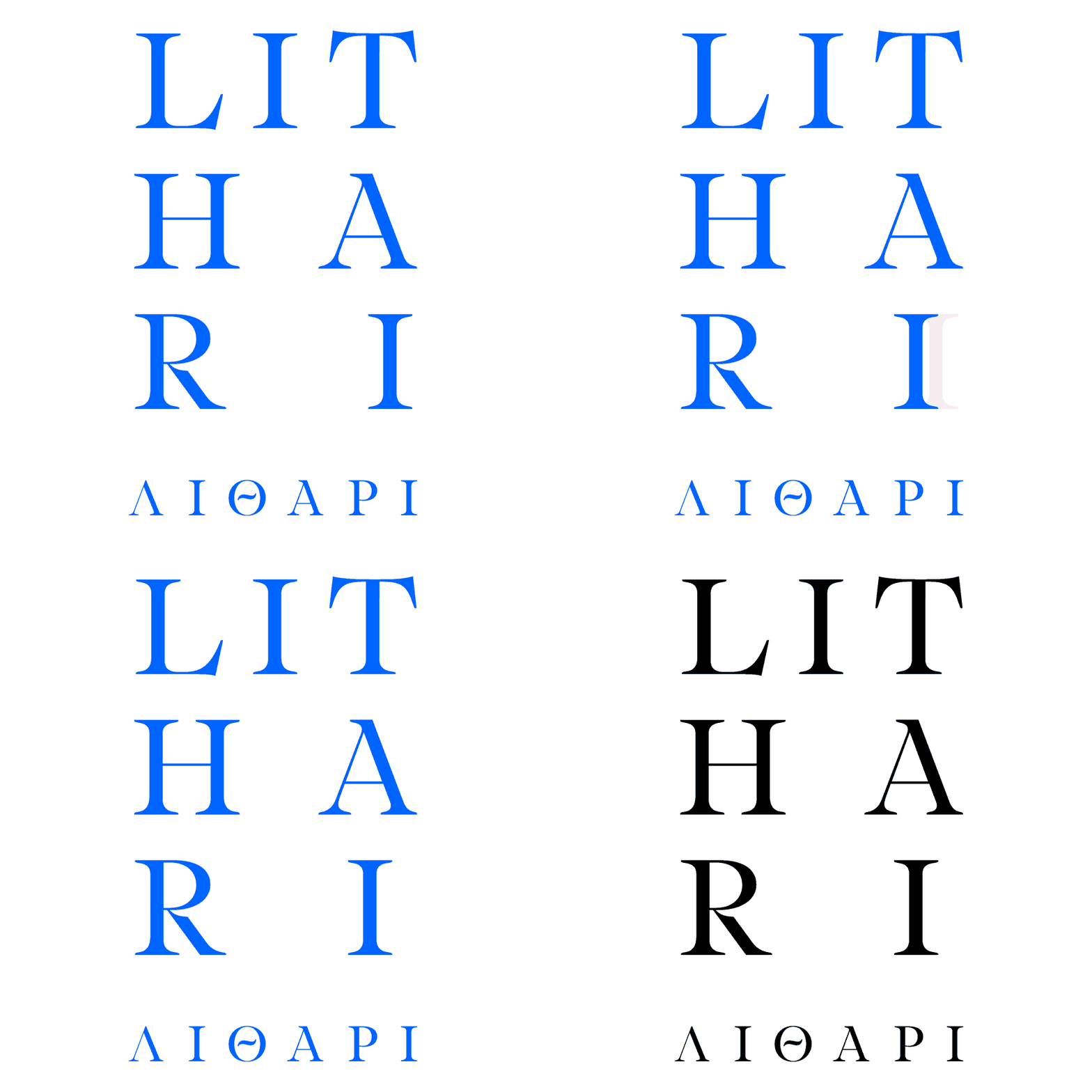
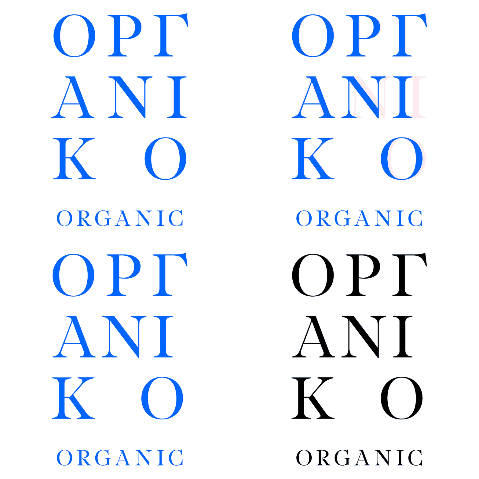
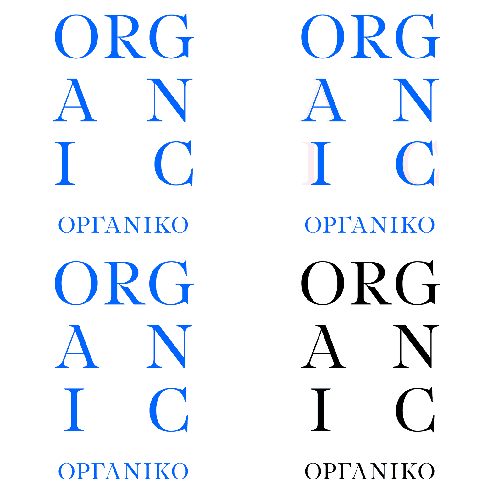
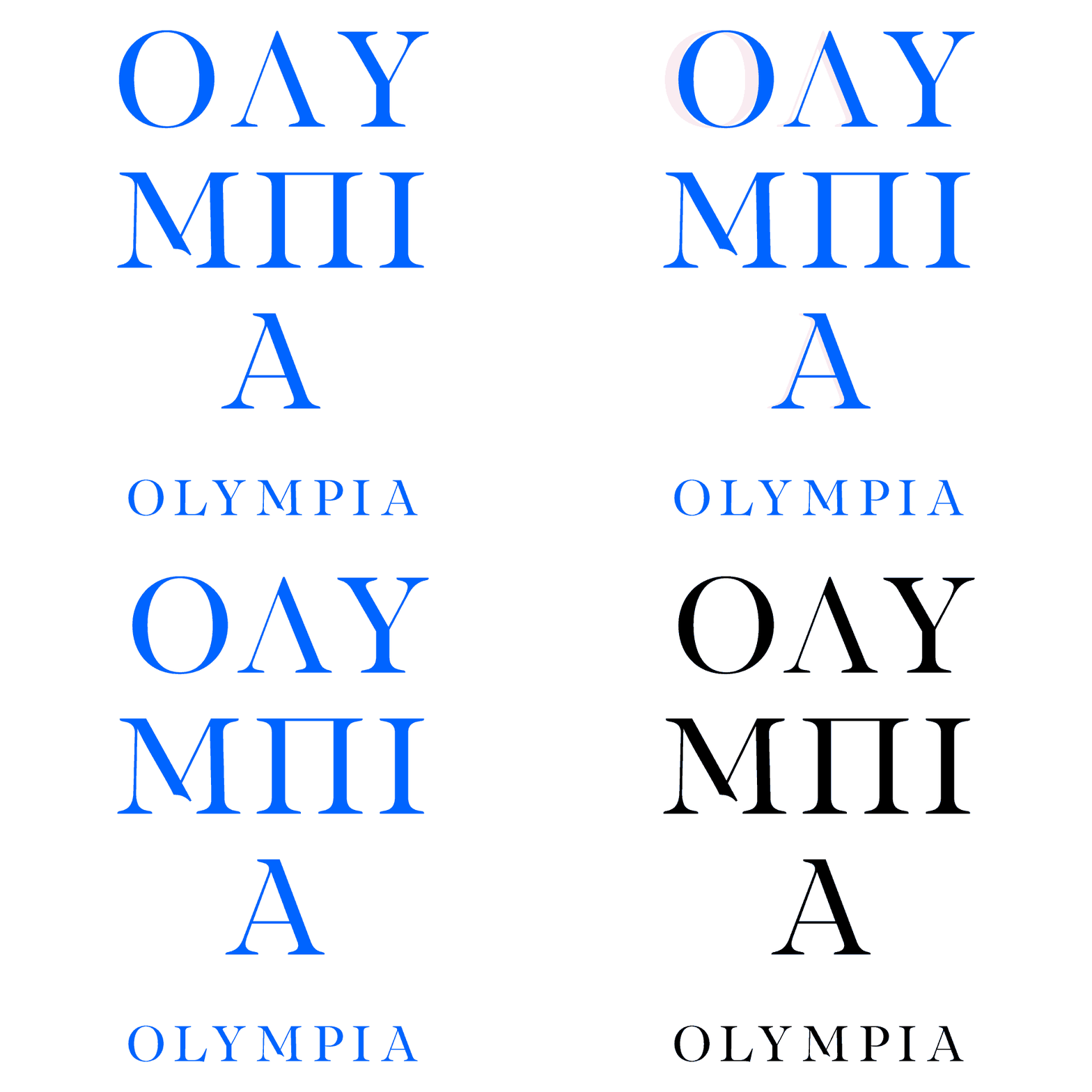
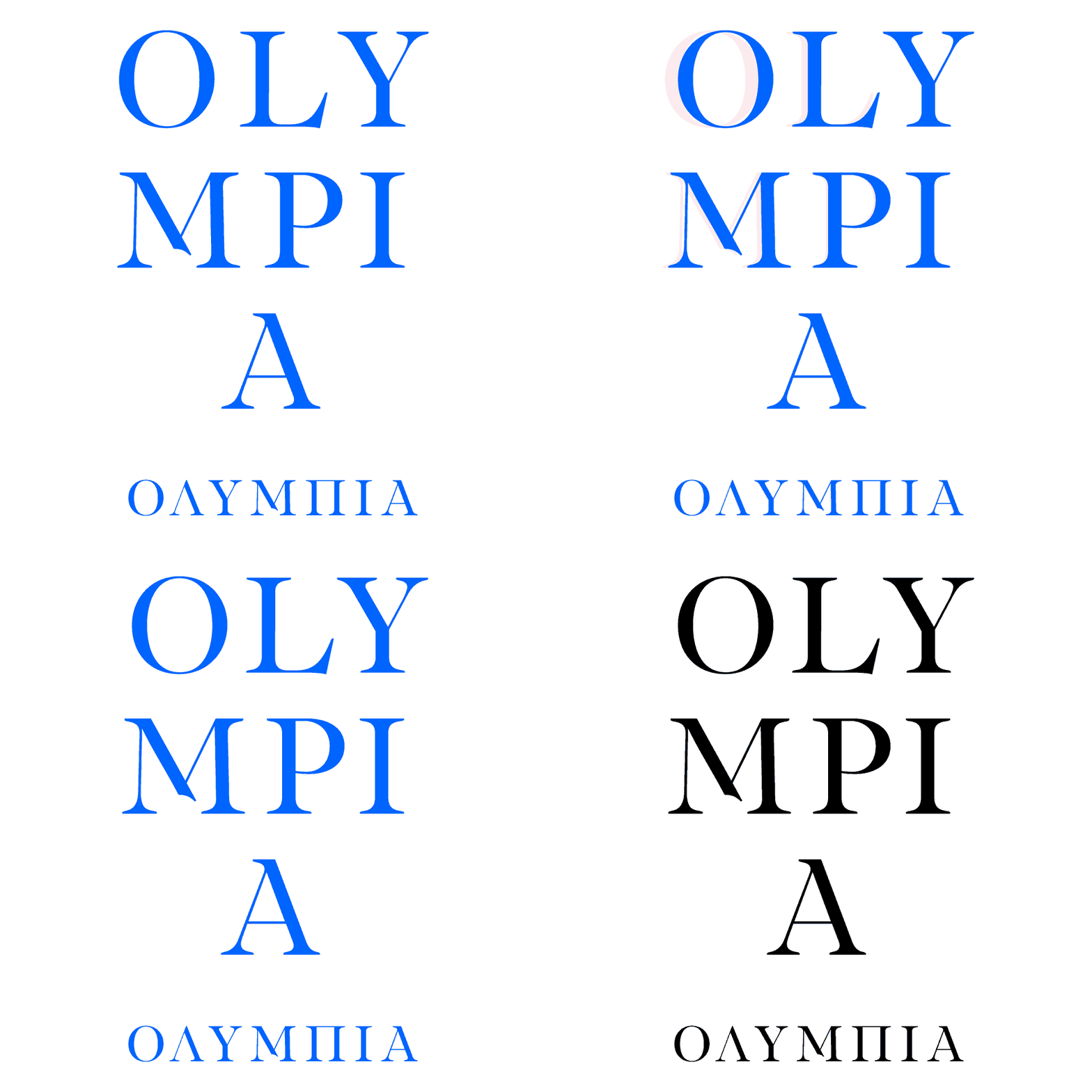
The typography was chosen based on the number of translations that will be needed, the timeless style of the design, the placement of the product in mid, premium category.
The product title was formed as a logo while the subtitle is added in Latin script.
The alignment of the letters allows the reverse layout of Greek, Latin.
The product acquires its own substance and value, while visually following the image of the rest of the product family, it is easily distinguishable, therefore recognizable.
Olympia Organic was renamed ORGANIC.
●
Creative Direction:
Undburo
Illustration:
Undburo
What we did:
Art direction, Branding, Identity, Illustration, Information Architecture, Logotype, Misc, Naming, Packaging, Print,

ΕΛ


EN
