Sofou.gr e-shop
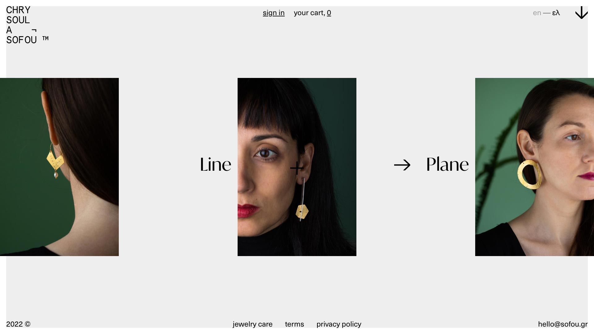
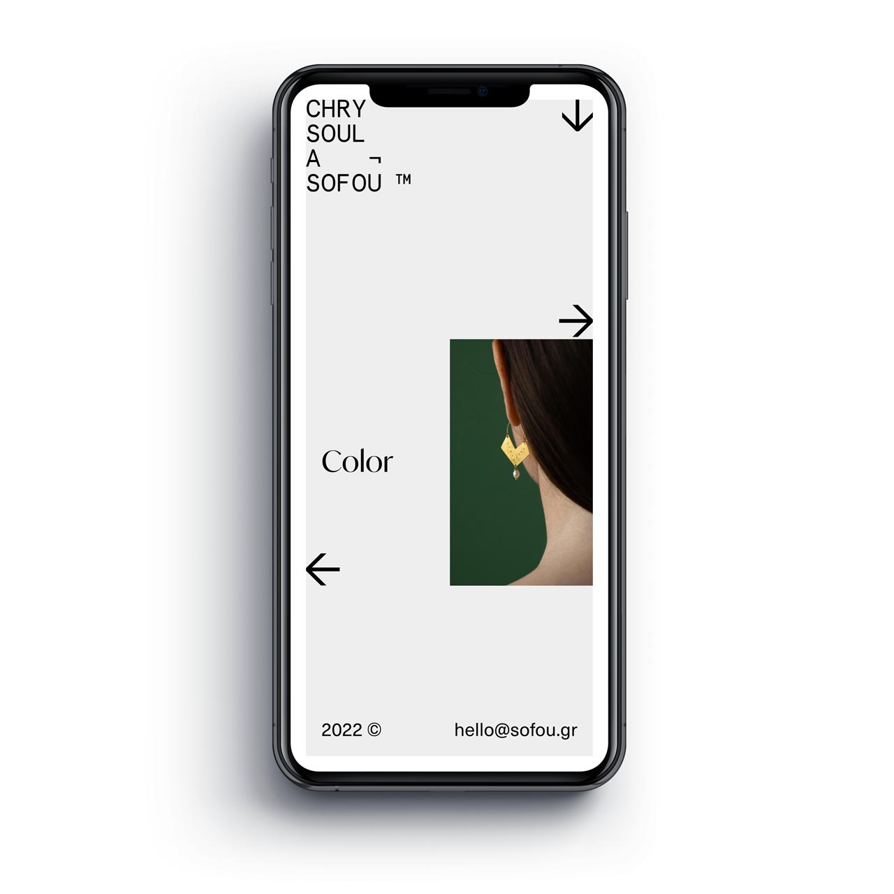
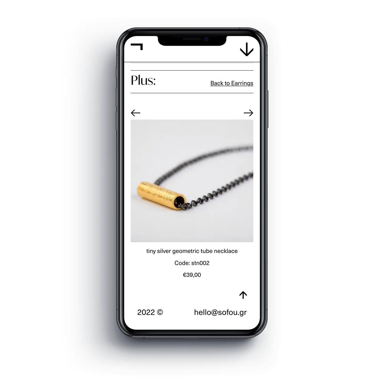
Chrysoula Sofou designs and manufactures jewelry. The resulting shapes as a whole do not want to illustrate, but to convey the sense of 'rhythm'.
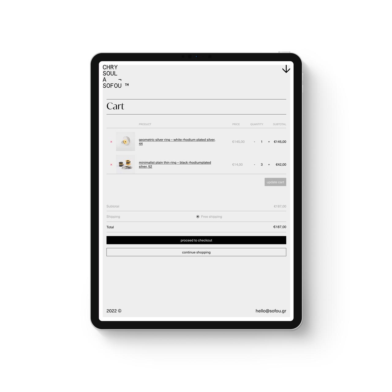
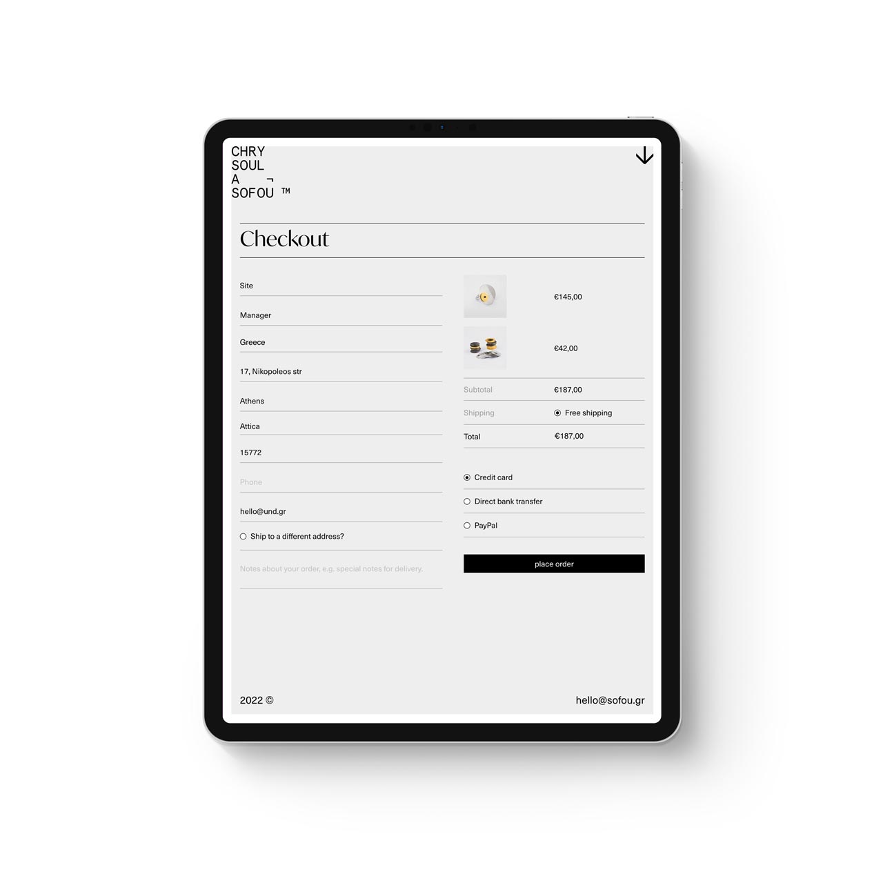
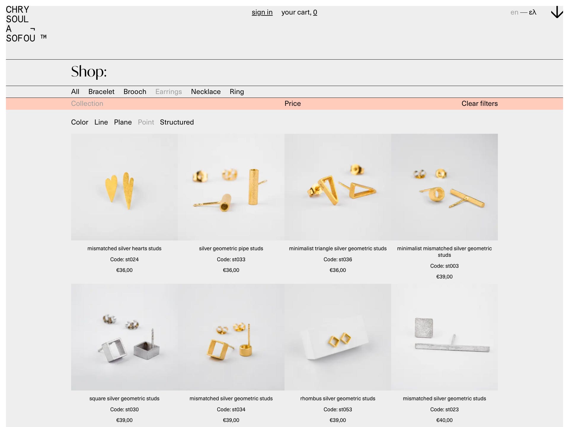
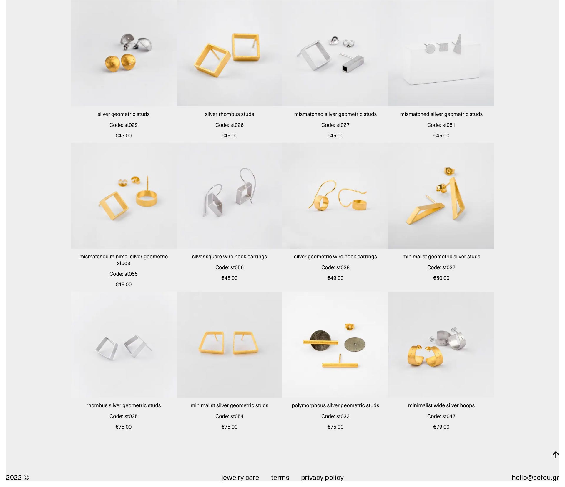
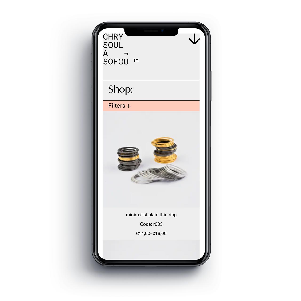
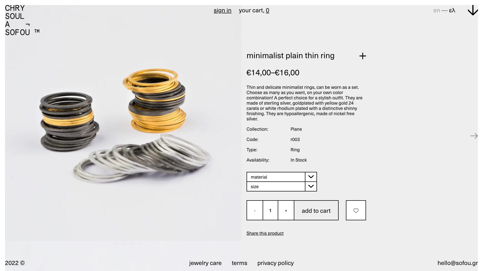
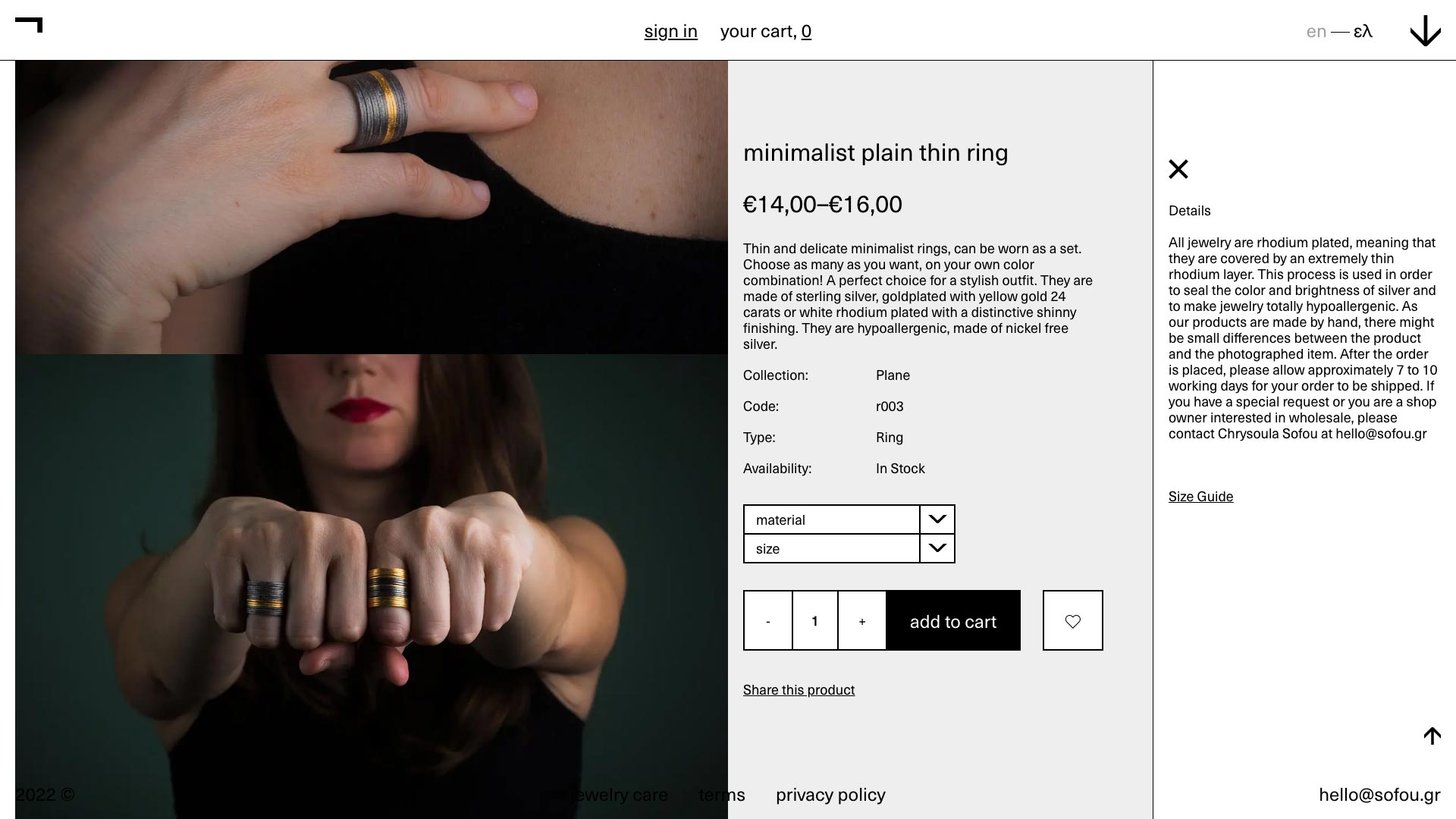
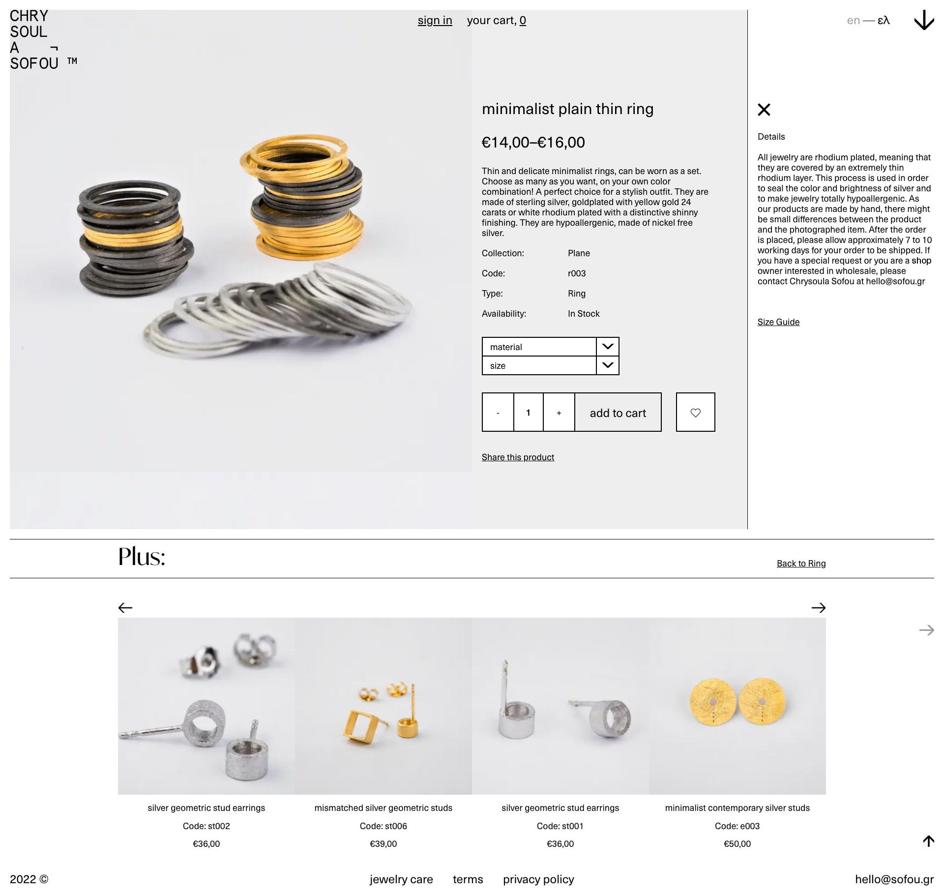
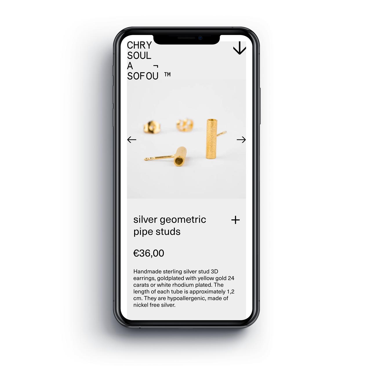
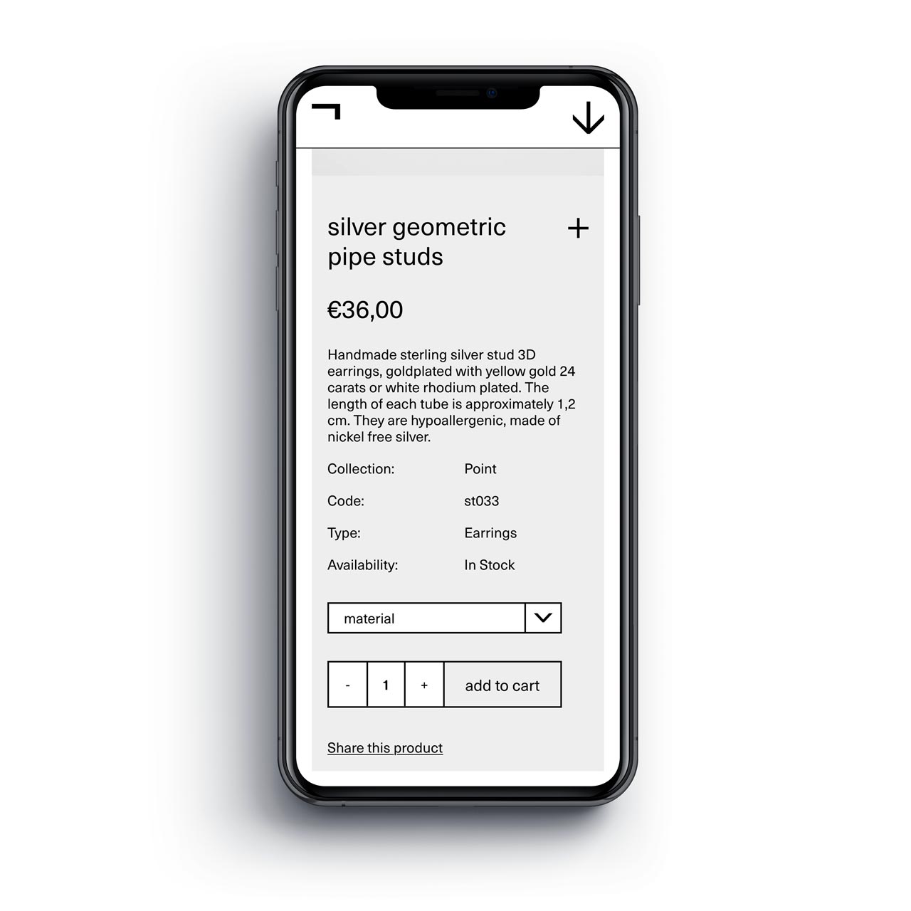
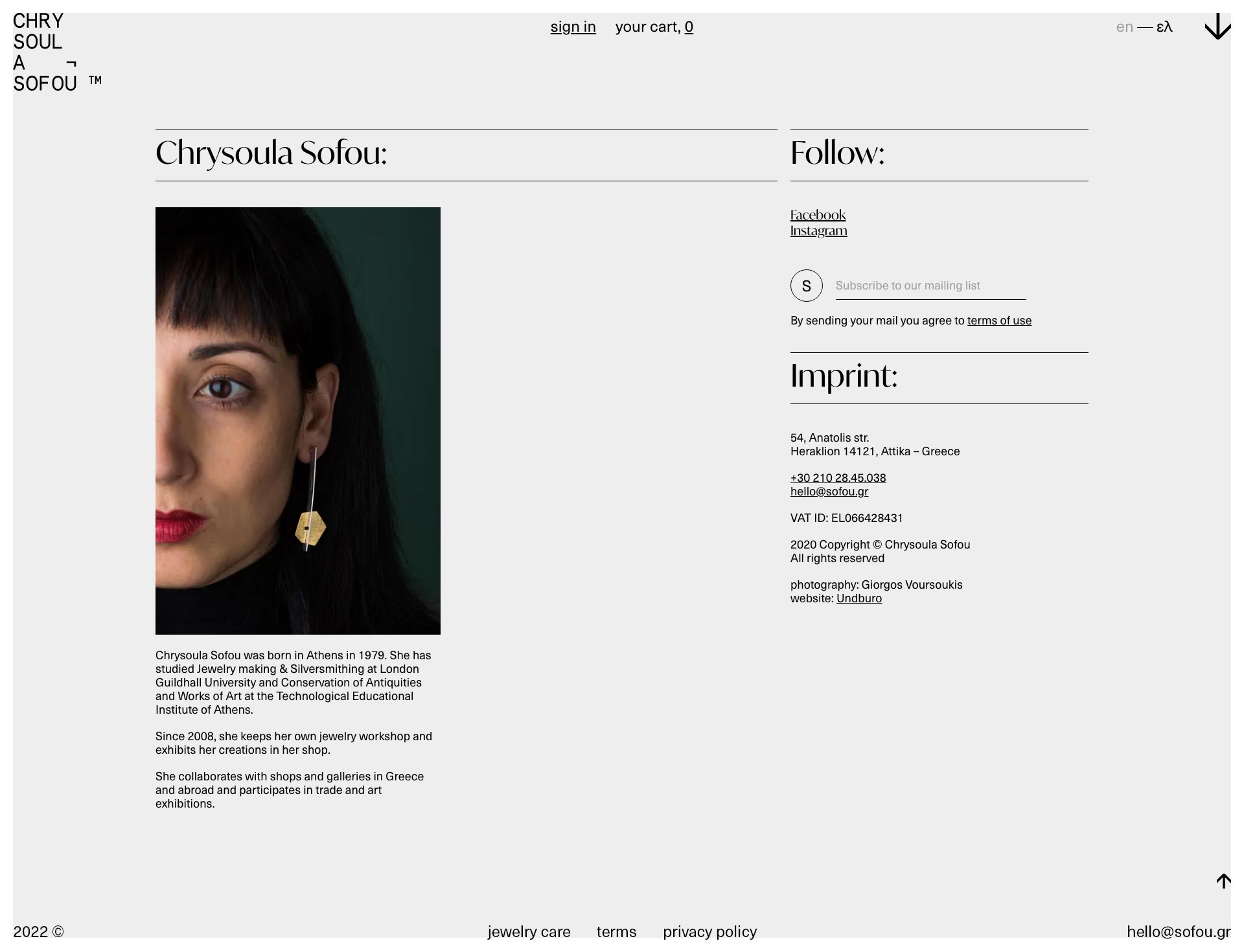
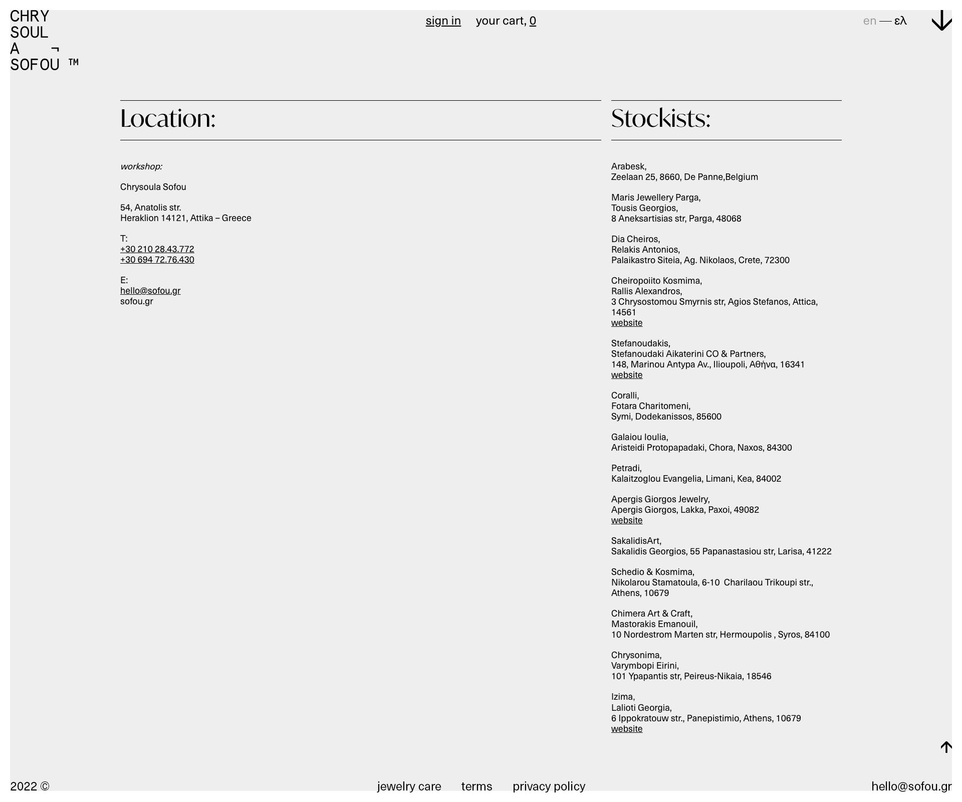
The online store of Chrysoula Sofou is strictly organized and free from any unnecessary decorative mood.
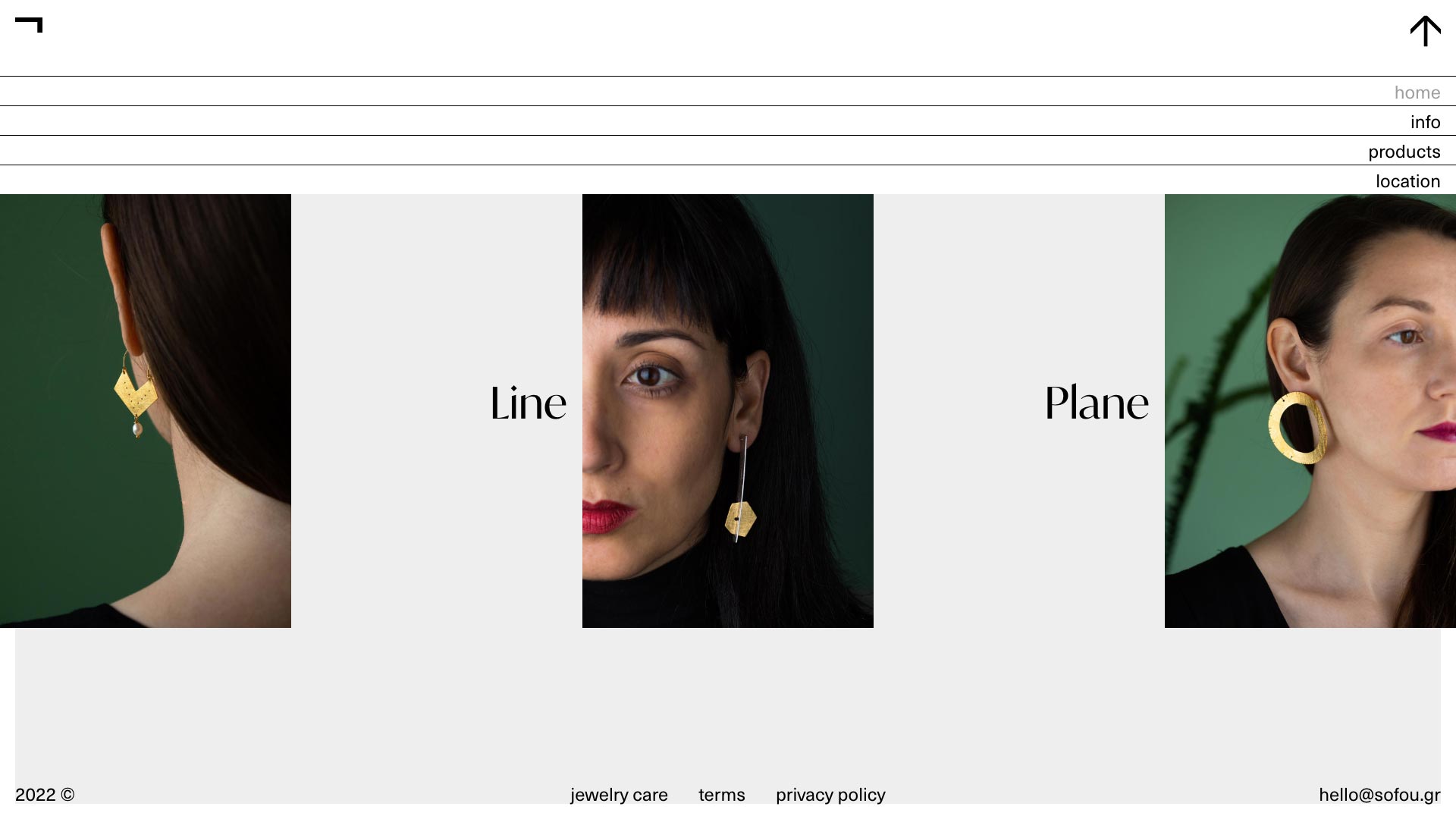
Intense, distinctive signage, simplified visual rules, dictate navigation in a clear and specific way.
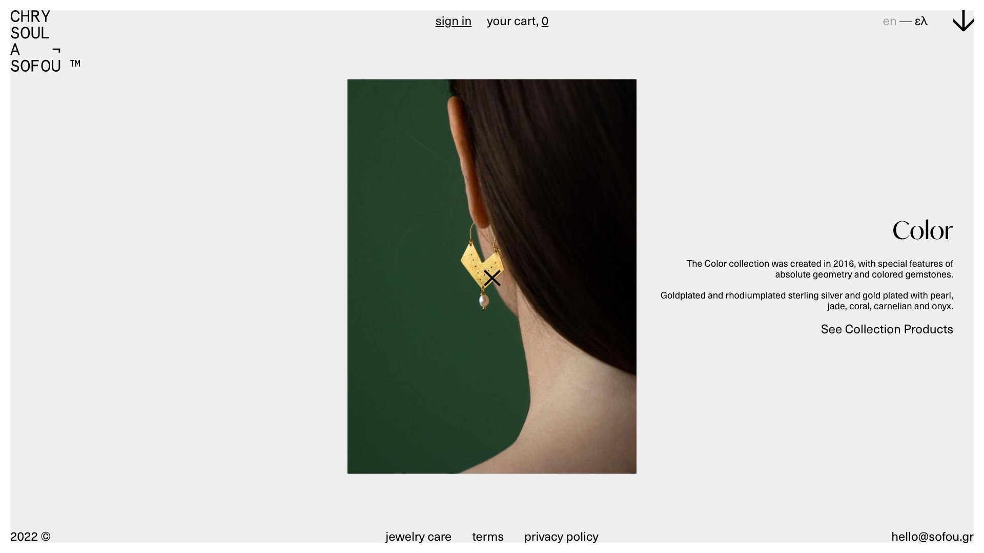
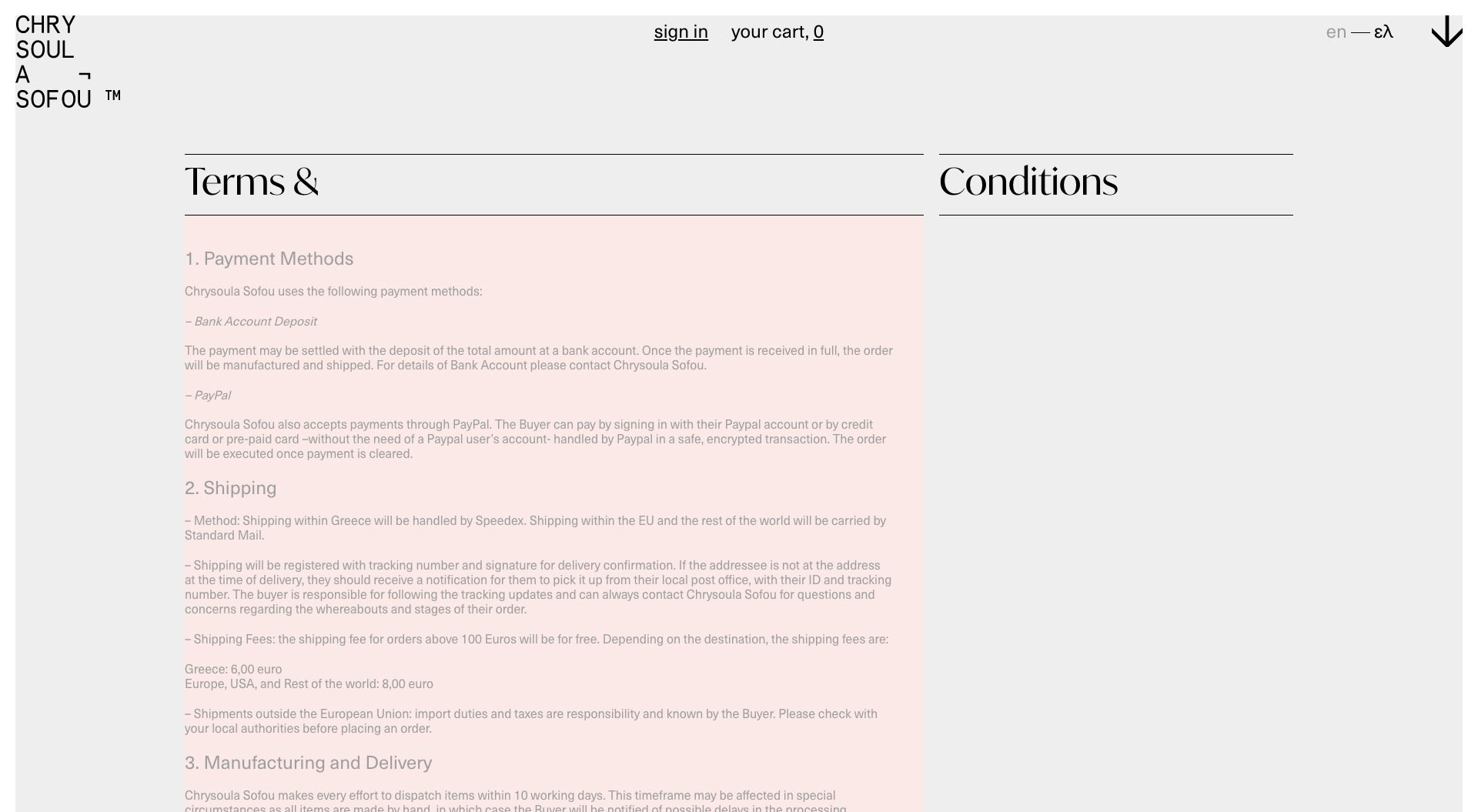
The color is delimited between black and two defined halftones.
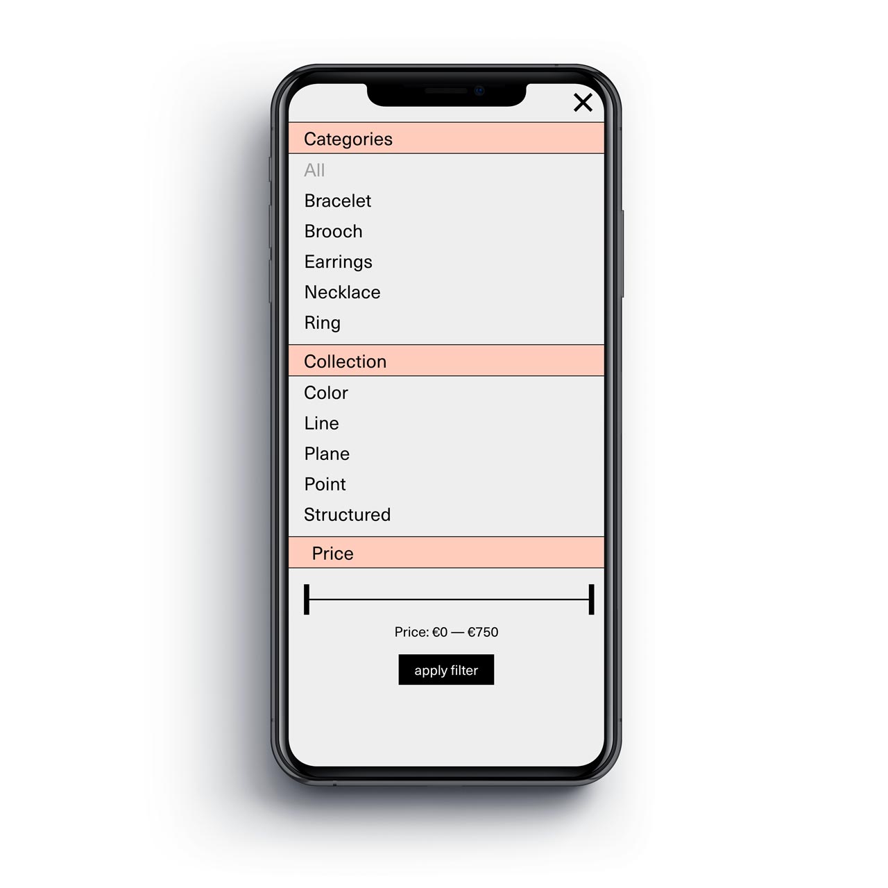
A single, minimal, color change is displayed, which immediately makes the environment distinct, in relation to the other presentation pages. This small differentiation acquires a functional role, indicating to the user those applications that facilitate product search.
The arrangement of the individual elements, structured in a strict rule, is emphasized by the existence of horizontal and vertical straight lines, which reveal the delimited, as the case may be, spaces.
What we did:
Art direction, Branding, Digital, E-shop, Identity, Information Architecture, Logotype, Misc, UI/UX, Website,
LPG

SPG
PDP
S×P
S×C
